The Modern Atlanta Home Tour is a two day self-guided tour of homes in Atlanta. The architecture tour is mostly private residences, but occasionally a few commercial buildings are featured. It is usually held on a weekend in mid June – MA was founded in 2007. The tour is the finale of “Design is Human Week” – a week of speakers and events focusing on design, sustainability, and innovation.
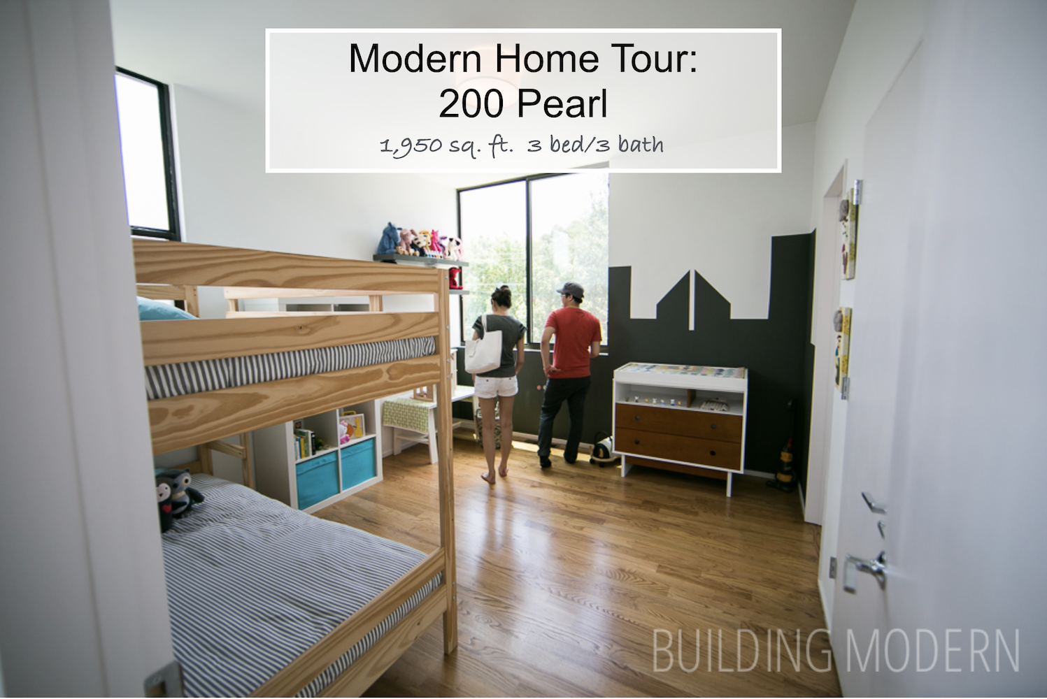
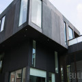
Project name: 200 Pearl
Location: 200 Pearl St. SE, Atlanta, Ga 30316
Architect: Brian Ahern & Jeff Darby of Darby Construction
Year Completed: 2012-2013
Square Footage: 1,950 sq ft.
Construction time: five months
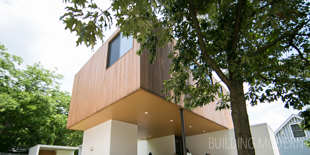
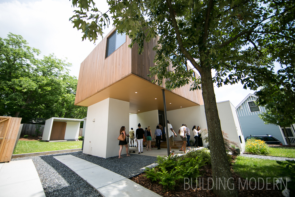
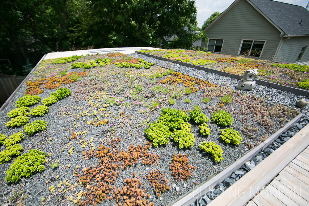
200 Pearl is part of a set of three homes on the tour by the same architect: Described as “baby moderns” – all feature open living spaces & “unexpected” exterior spaces in common. 3 bed room, 3 bath. The tour book specifically sites: spray foam insulation and aluminum windows for energy efficiency. To create a modern aesthetic the houses use variable ceiling levels, flat roofs, concrete floors on the main level, random-width oak floors & minimal interior trim. Cementitious panels are used on the exterior. Local trades people sourced readily available materials, “making each home unique”. Each home boasts a “european kitchen”…. (aka, Ikea.) None of the homes had garages. The feature that makes 200 stand apart from the other two Pearl Street residences is it’s green roof paired with the roof-top terrace.
The profile of this house, which is basically two rectangles, reminds me of a home made of containers or possibly a prefab/modular house. To me, this house feels much smaller than the other two Pearl homes – it is smaller, but only by 150-200 sq. ft..
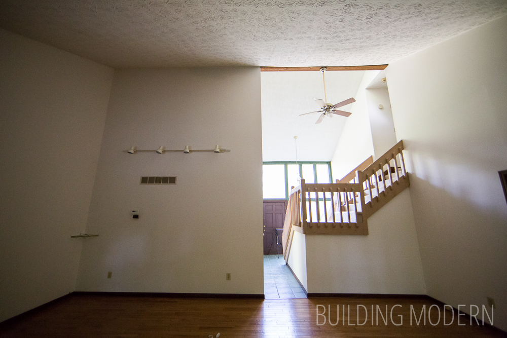
View as you enter the front door:
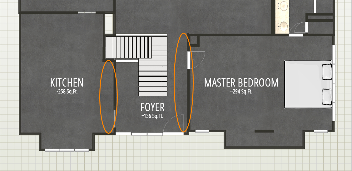
To me, the wall immediately in your face chops up the flow of the house.
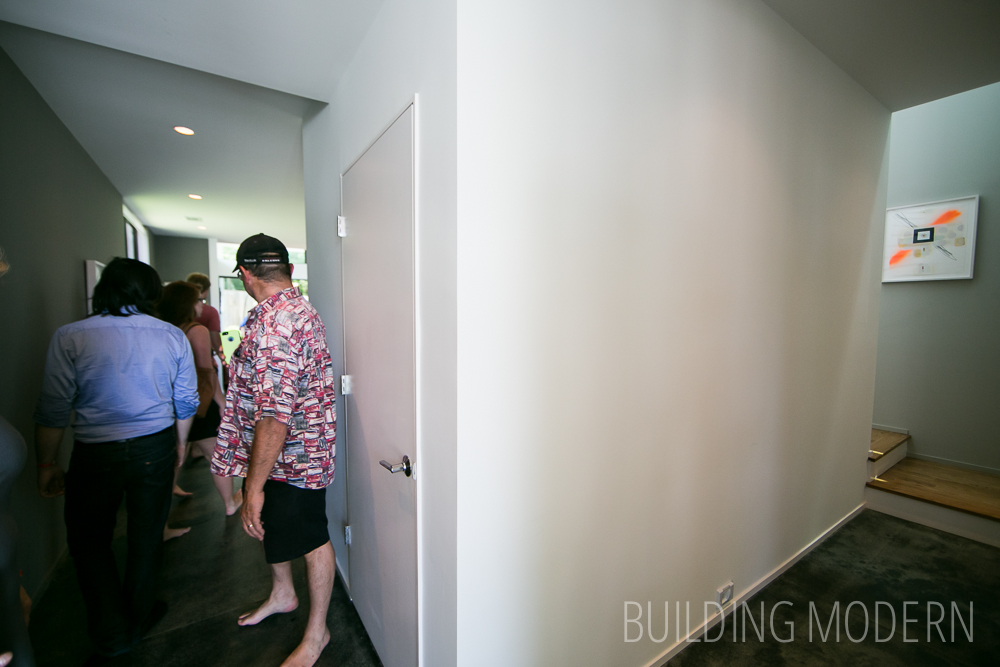
Choosing the hall to the left, walking past what I’m guessing was a closet –
into the kitchen/dining/living room.
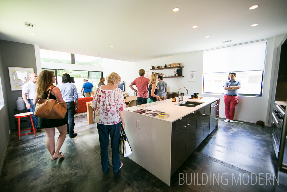
Moving to the right side of the kitchen, looking toward the living room from the dining area. I liked the clerestory windows along the two sides, creating an asymmetrical look.
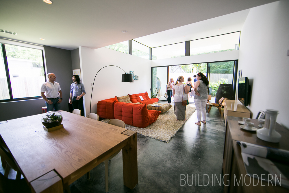
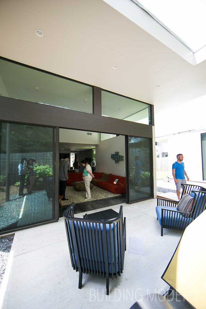
View of the living room from the sliding doors. The ceiling does lift up in this space, but not nearly as high or as dramatically as in 184 Pearl.
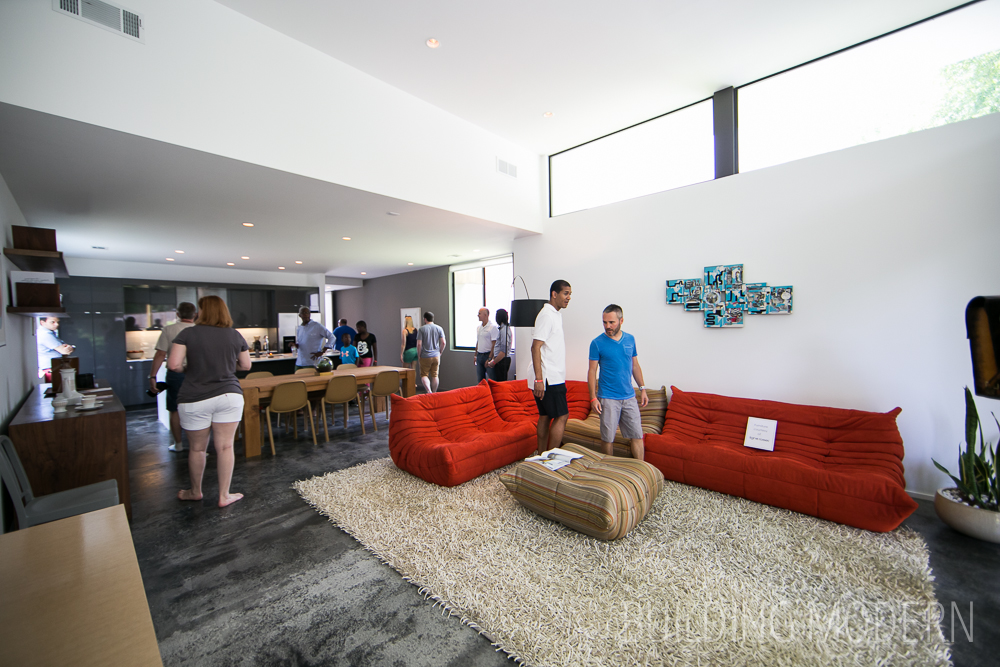
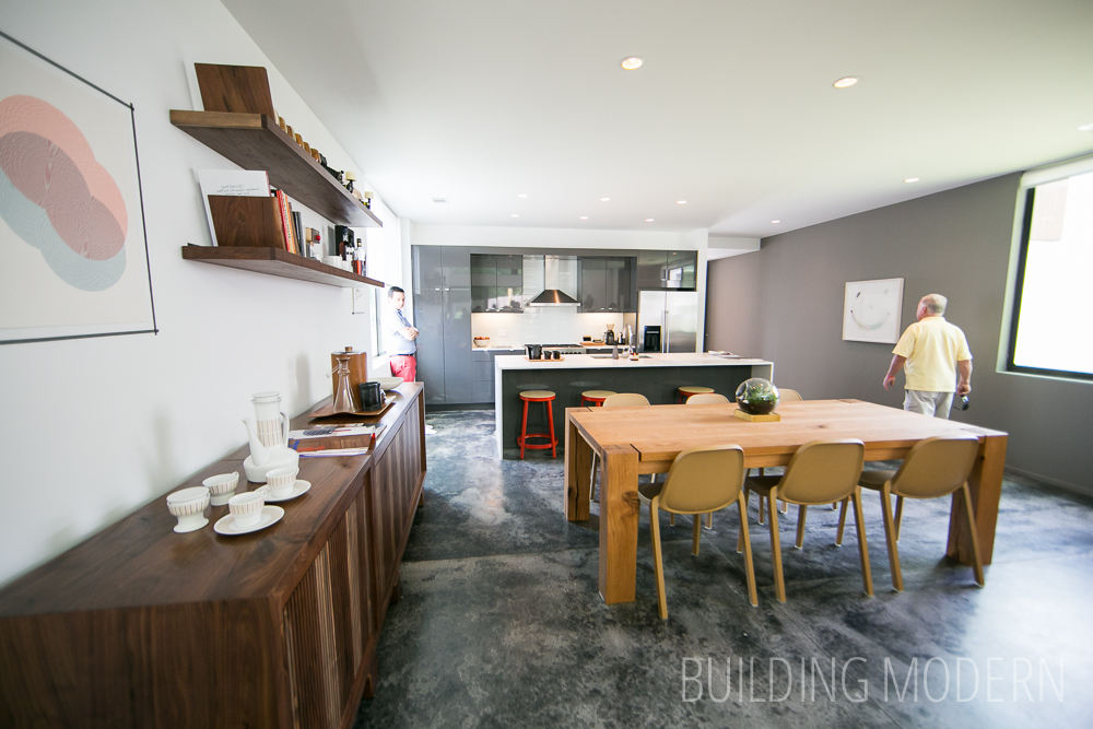
Looking back at a slightly better view of just the dining area and kitchen. High gloss grey Ikea cabinets and an island with a waterfall countertop.
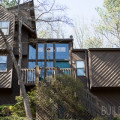
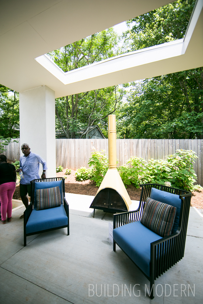
The patio through the sliding door off of the living room – at the back of the house. The opening in the patio roof was a great way to make the ceiling feel less heavy and vent the fire pit – though, I do wonder about functionality if it rains.
Turning back around to view the back side of the house & living room.
This house has more yard on the side rather than the back. The book describes the separate building as a “studio/storage building”.

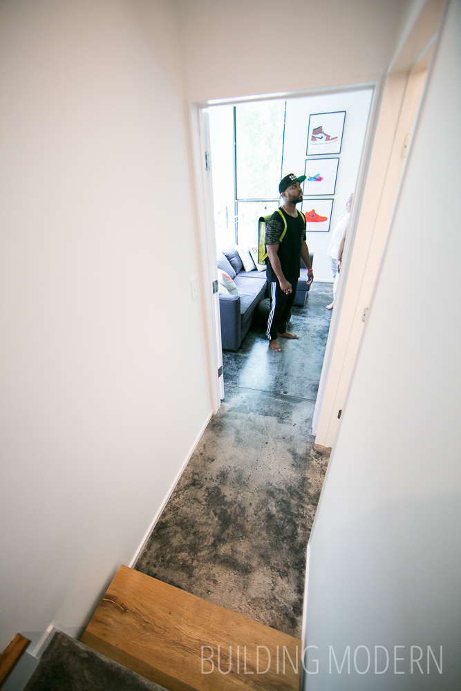
Back inside – after walking back through the front door, this is down the right-side hallway… there is a little hall to the first bedroom suite on the right. (Facing the front of the house.) Notice the single wooden slab step between the different levels of concrete floor.
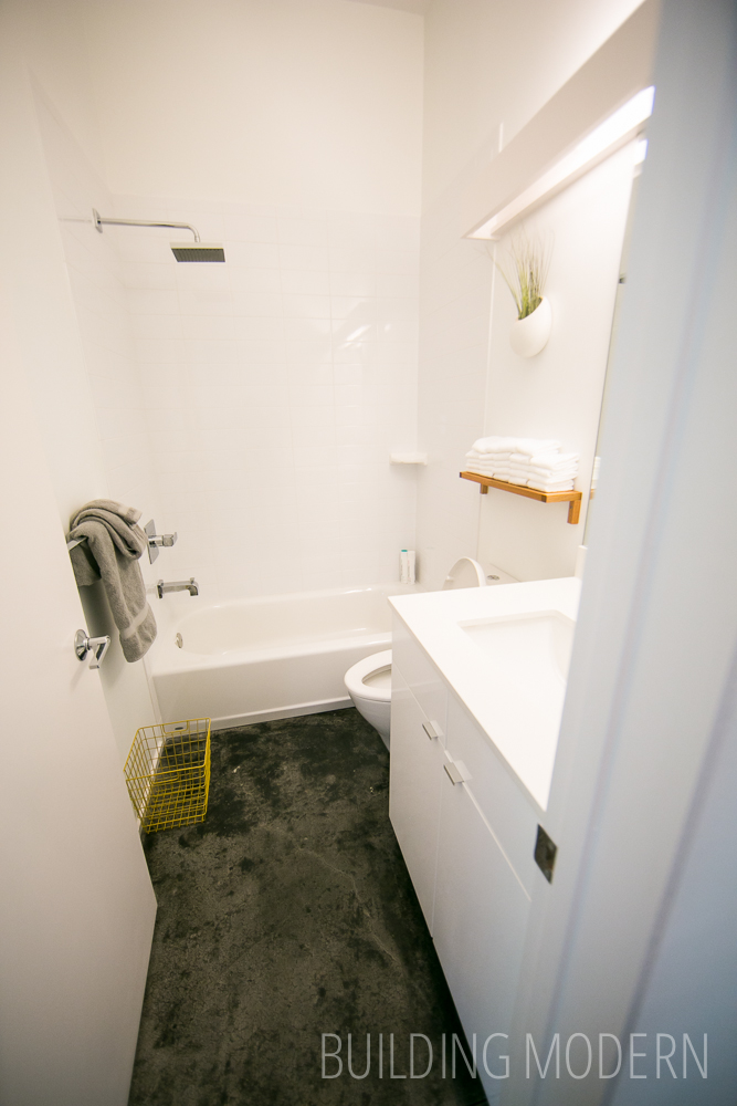
The first bedroom’s bath/first floor guest bath.
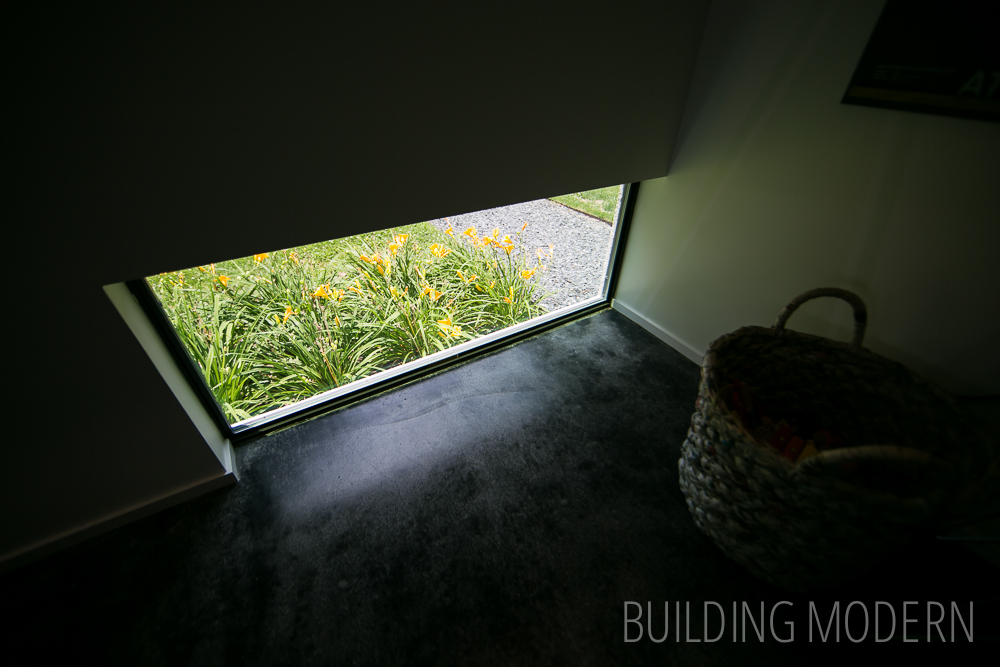
First bedroom. Note the super low horizontal windows that work well for “sitting views”. Since it was separated by its own little hall, that was two steps down from the first floor, this bedroom felt more private and separated from the rest of the house. This room could easily function as an office, especially since it isn’t near the front door.
Also, there’s a floor window – great for keeping an eye on your day lilies!
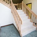
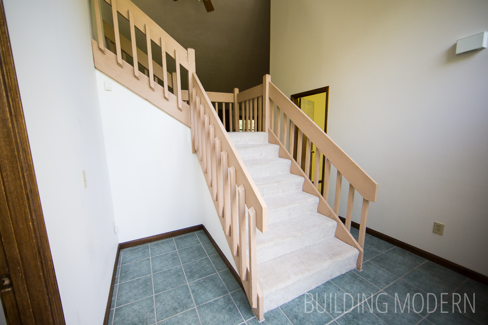
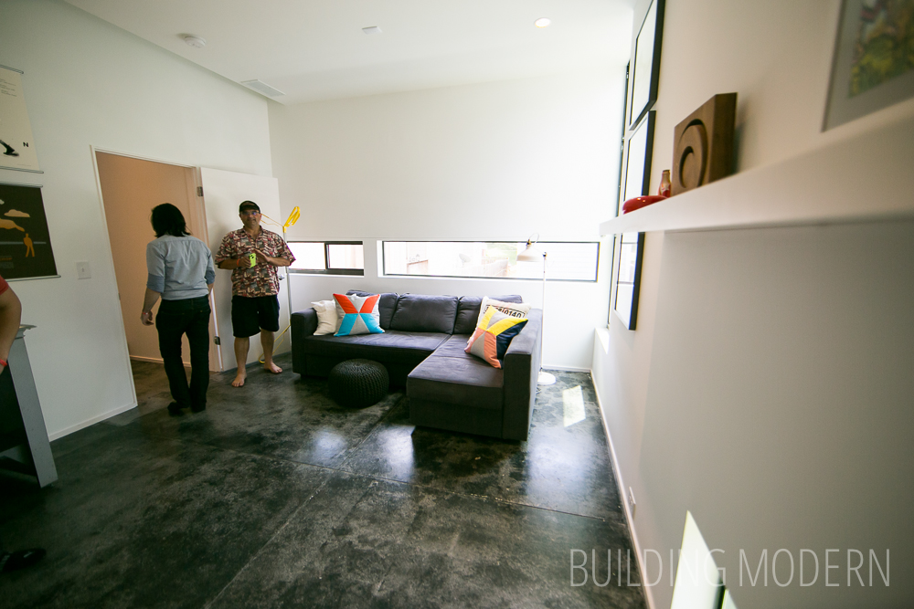
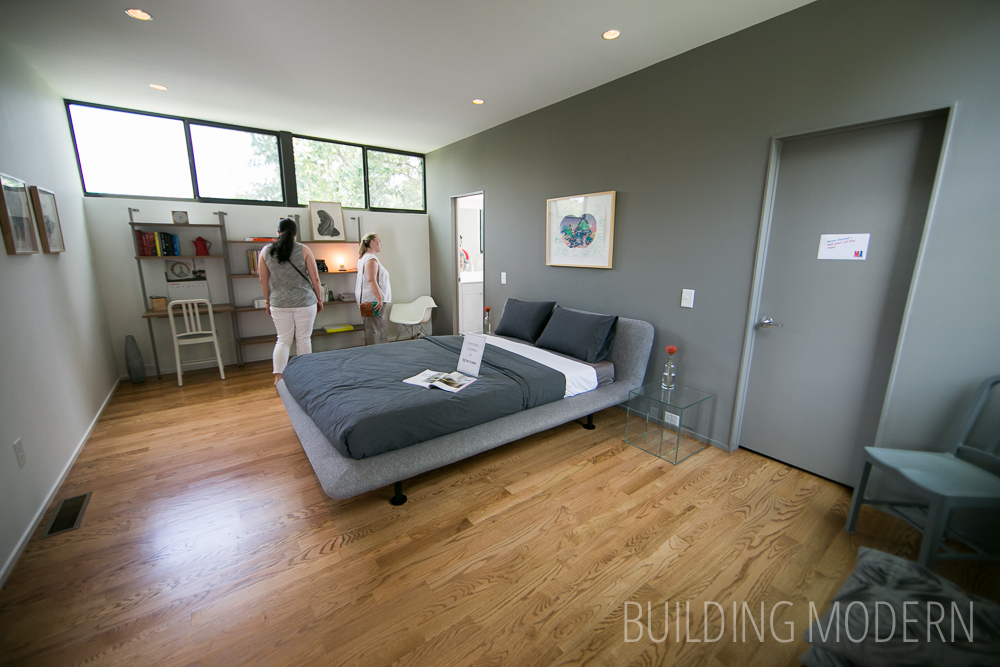
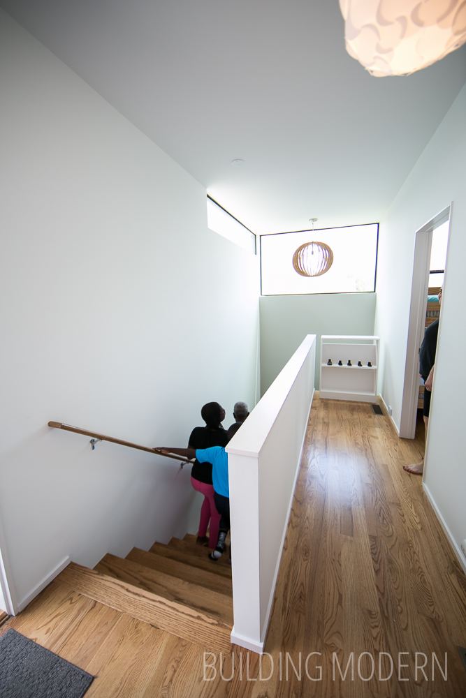
The second floor has oak flooring and two bedrooms, two bathrooms, & the roof terrace. Since these bedrooms were on a different floor than the first (and since the first felt so private), it was easy to forget that this was a three bedroom house.
The master bedroom:
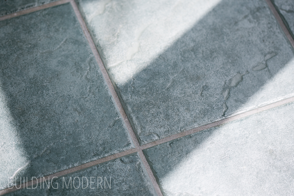
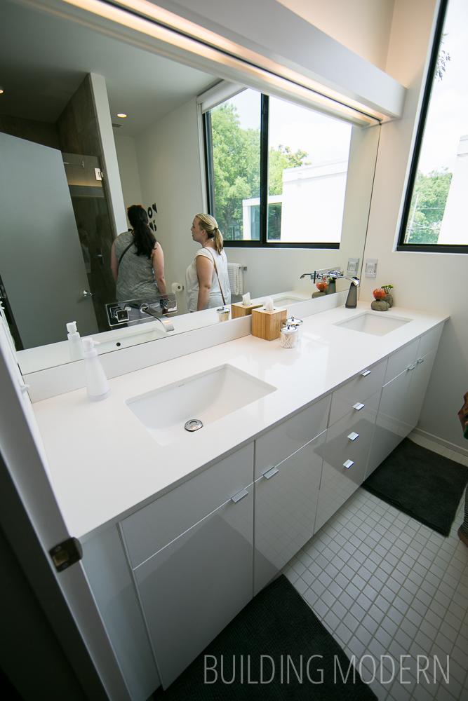
Master bath. Unlike the first two Pearl homes, this house had plain square tile that was common on the tour this year.
Roof terrace and green roof. Spencer is noticing that the floor boards wern’t completely fastened down.

The upstairs hall – the door to the terrace to the left (at the top of the stairs) and at the end of the hall is the kids bed room.
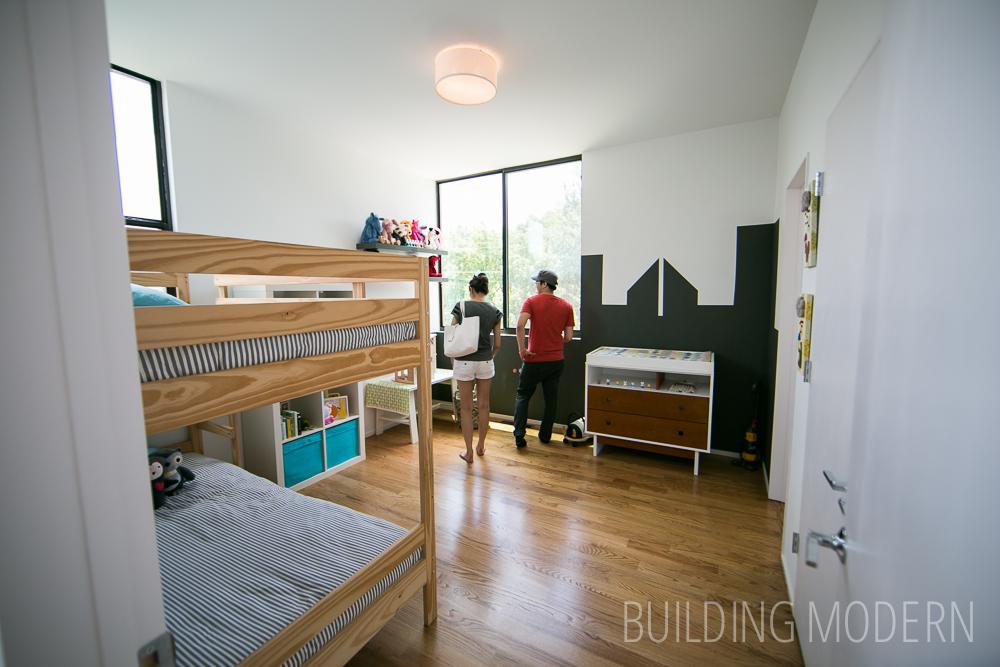
Nice, big windows and ceiling height in the children’s bedroom.
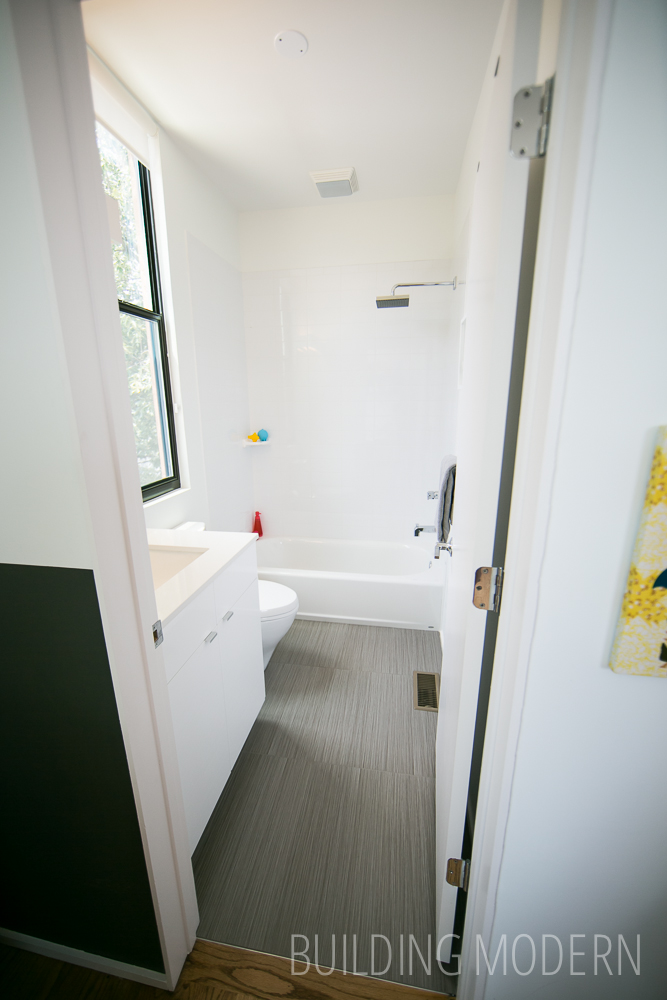
The bathroom off of the kid’s room. They have much nicer floor tile in this space than the master bath.