The Modern Atlanta Home Tour is a two day self-guided tour of homes in Atlanta. The architecture tour is mostly private residences, but occasionally a few commercial buildings are featured. It is usually held on a weekend in mid June – MA was founded in 2007. The tour is the finale of “Design is Human Week” – a week of speakers and events focusing on design, sustainability, and innovation.
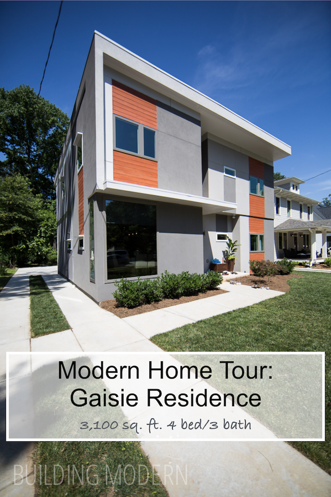
Project: Gaisie Residence
Location: 620 Sycamore Drive, Decatur, GA 30030
Architect: Godfrey Maisie with Stanley Beaman & Sears Architects
Interior Design: Kara Gaisie
General Contractor: Bongers Homebuilders
Square Footage: 3,100 sq ft.
4 bedroom, 3 bath
2 levels:
– dining room, kitchen, living, playroom (or flex space), bedroom, bathroom, deck
– master bedroom, master bath, deck, two bedrooms, bathroom
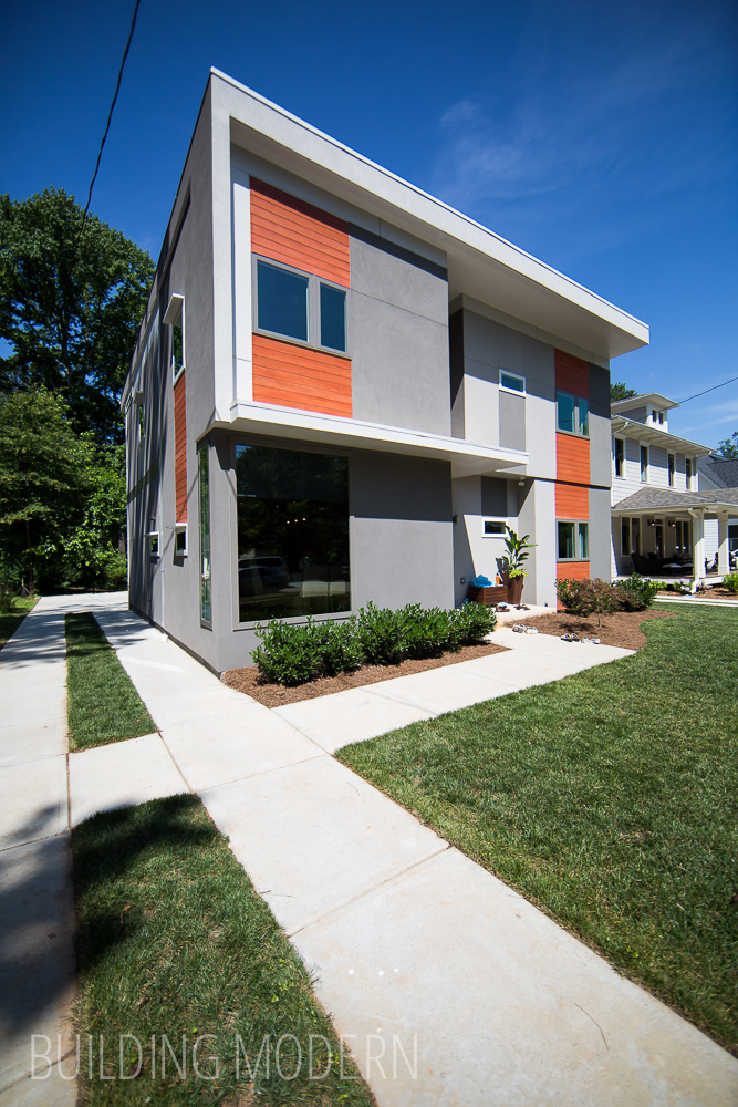
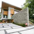
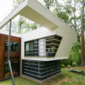
I like the modern touches on this home’s exterior: a grey two-toned stucco paired with a wood accent. (In this case, the wood was painted or stained orange – other homes have used Ipe or another exotic hardwood. I, personally, prefer a darker grey for the stucco.) The orange accent color links some, but not all windows vertically… and just a few lines have been pressed into the stucco subtlely accenting the windows. Actually, this wasn’t the first home on the tour that we saw with a grey/orange color scheme. Salmon Residence also featured orange painted wood accents, but the majority of that home was covered in a grey cement board & painted concrete block.
The crisp white flat roof wraps around the second floor in a way that creates an asymmetrical shadow line on both floors. The windows on the side of the home (that are not protected by the overhang) have their own little “eyebrows” – I assume a function to keep the rain away. The home has different dimensions to the front facade, something that could have easily been just a flat box if it were a more traditional home.
It seems the designer really took care when thinking about the exterior… though, in retrospect, I don’t see any gutters. Anyway, on with the tour!
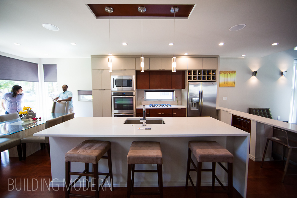
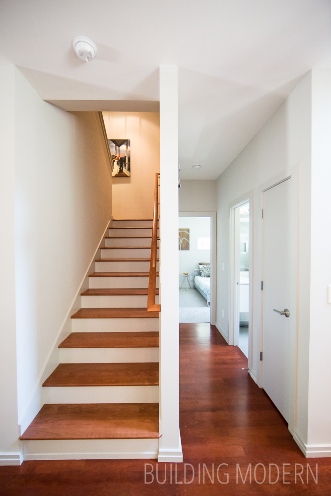
The view of the kitchen upon entering from the front door: out of frame to the left is the dining area… and to the right is a hallway & stairwell up to the second floor.
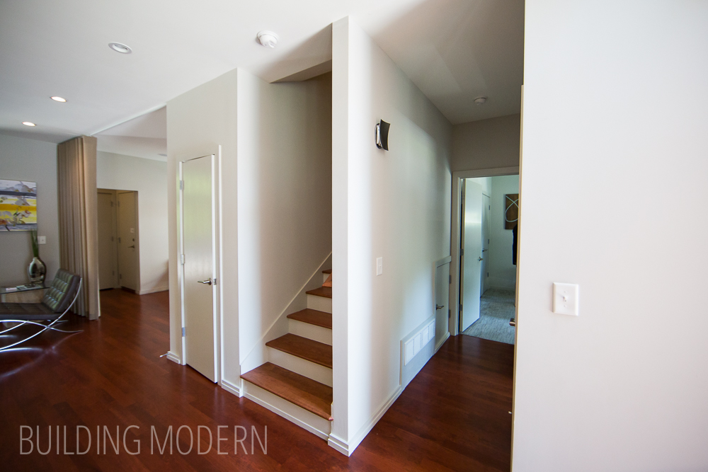
Turning to the right to see a hall that leads to a bedroom & bathroom. Stairs lead up to the second floor, and if I recall, an unfinished space.
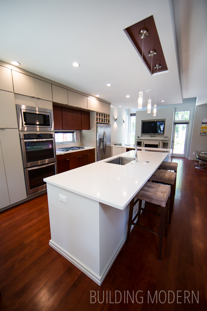
A view of the kitchen where you can see the dining area at the front of the home. The color in the inset island light area mirrors the cabinet accent color. Notice the one sided waterfall island – a fun alternative to having both sides… it kind of reminded me of the exterior’s roof. The almond/beige color of the cabinets was a unique choice for a nearly all-white-walls home. The color is still light, while not being monochromatic.
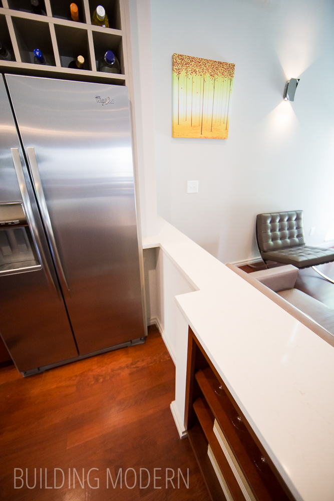
A pony wall separates the kitchen from the living room. Notice the cut out in the counter that allows the refrigerator door to fully open. (I’m not sure if this was an oops moment or intentional from the start.)
This little shelving unit in this spot supports the countertop & hides the vent.

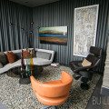
Moving on to the living space. I like how the whole fireplace/tv/shelving area stands off from the wall as a whole unit – flanked by a door and similar window on the other side. On another note, the cherry stain on the floor seems a bit dated – I believe that this has been the only home (in the years I’ve attended the tour) with this flooring color. But, do what makes you happy: if it’s cherry or dark or light floors is what you love… go for it!
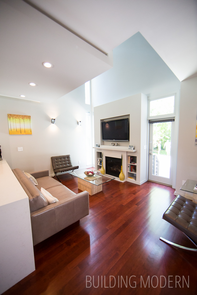
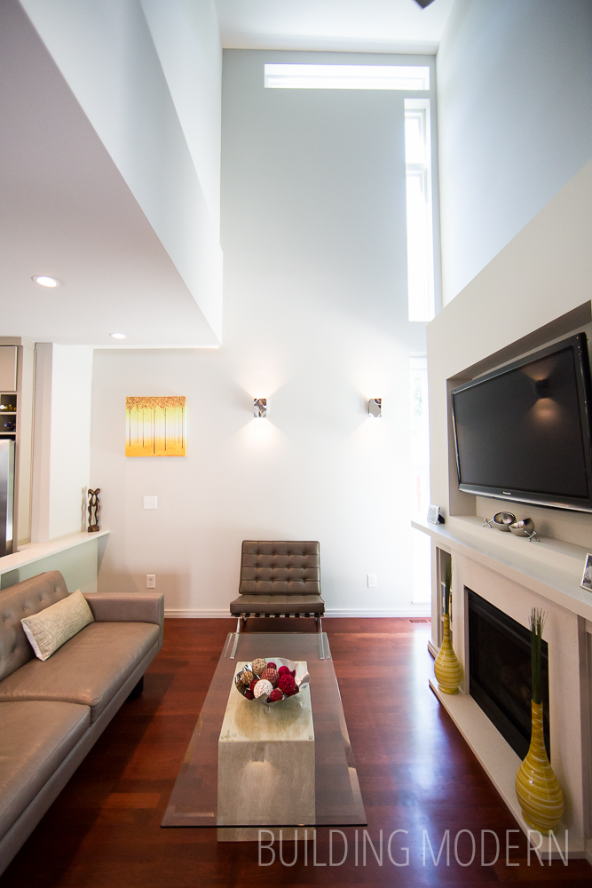
The ceiling changes to two-story height in the living room. Thin windows extend up the hight of the room & make a turn.
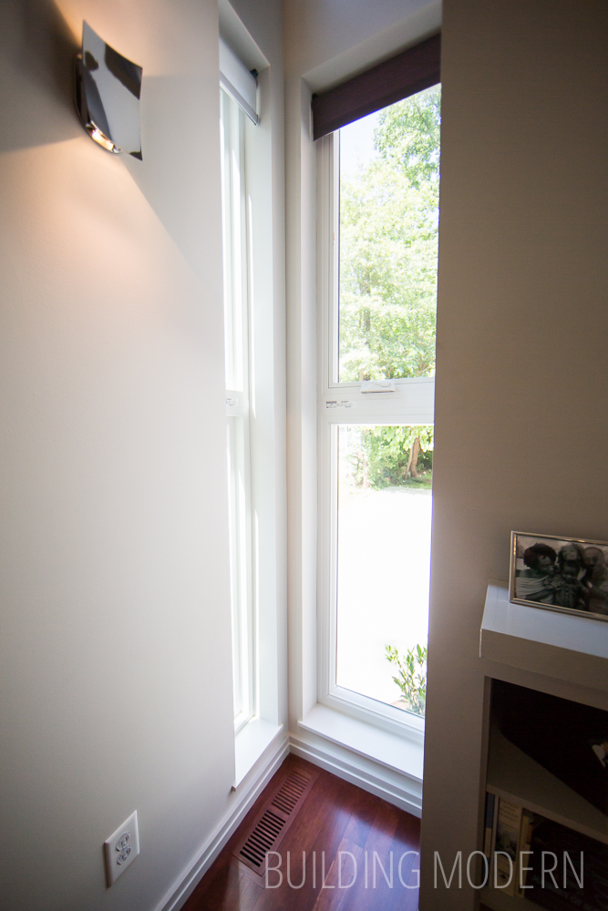
There is another thin window in the corner: bring in light to a normally dark area of the home.
Looking back from the far corner of the living room: in the background is a flex space with a curtain to separate the rooms. Behind the curtain, to the left, is access to the back side of the house. Above, you can see windows from the master bedroom. The big box-type section above this end of the kitchen is the master bathroom.

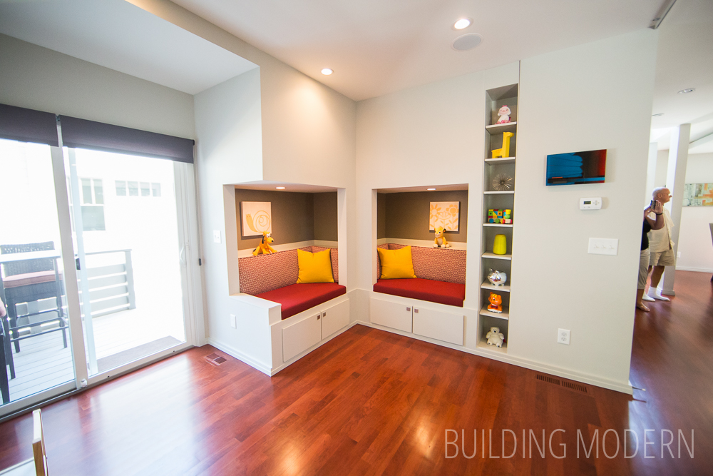
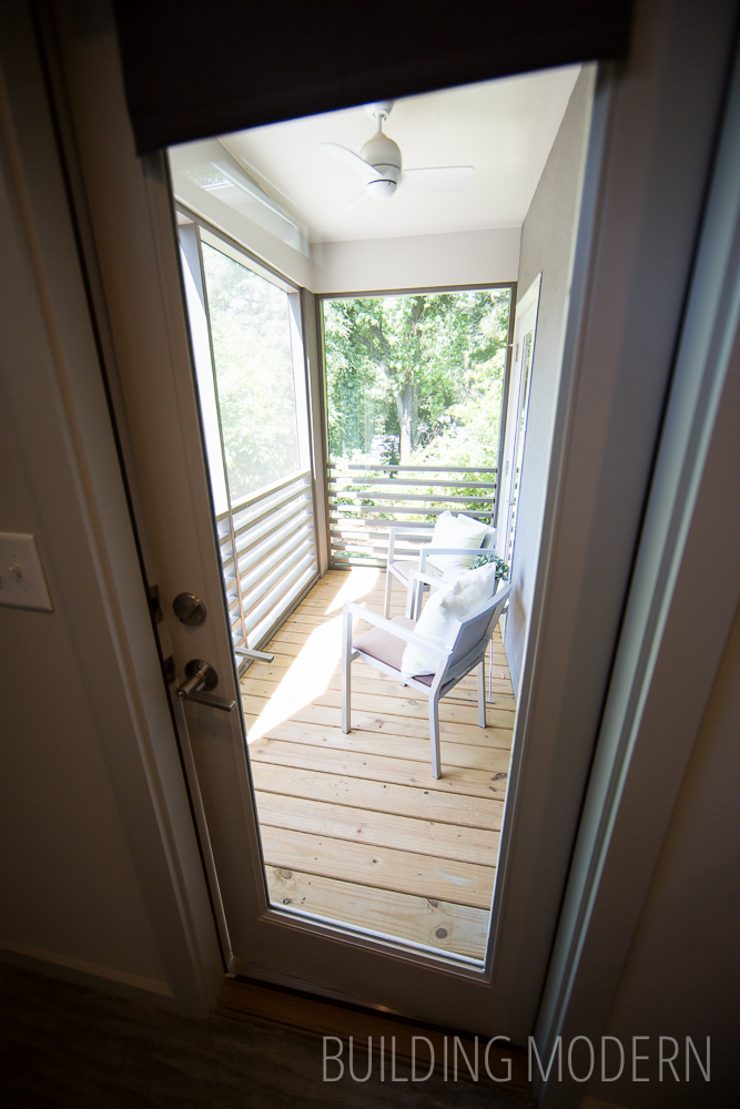
The flex space currently used as a kind-of play room for kids. The seats integrated into the walls take advantage the space under the stairs (they turn and lead to the second floor & an unfinished area). A small deck is outside the sliding glass doors.
Taking a look at the stairs & hallway at the front of the house again. That first door is probably a closet.
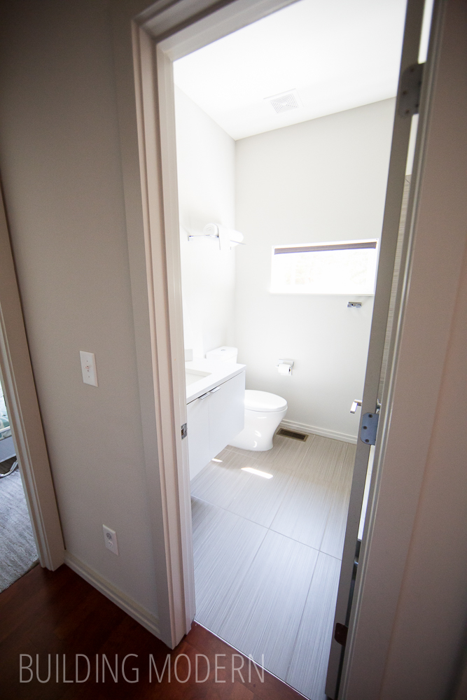
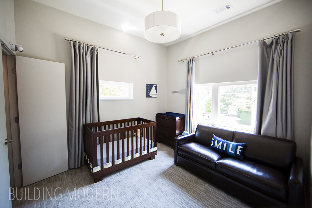
Staying on the first floor: a bathroom & bedroom. There is duplicate placement on the floor above… a hall bath & baby’s room.
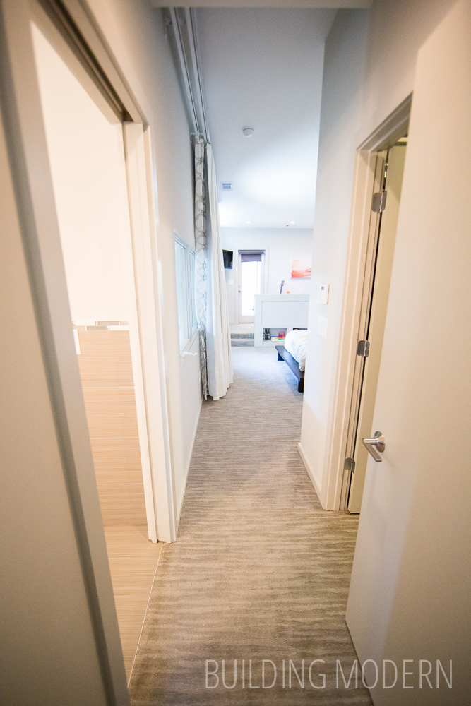
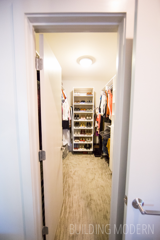
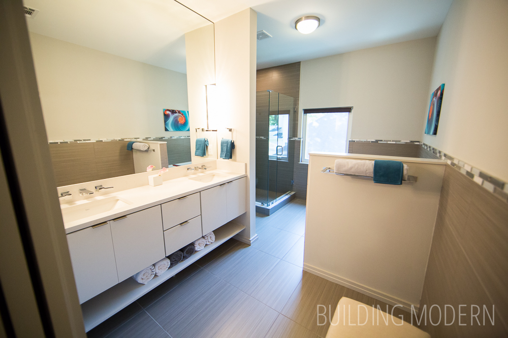
Upstairs the master suite has it’s own wing of the house. Past the door is the master bathroom on the left (beyond that are the windows that look down onto the living room) and the closet is on the right.
Turning right: the closet…
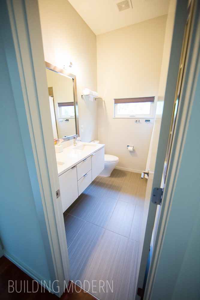
…and to the left the master bathroom. I like the shelf under the vanity with the rolled up towels. Behind the right half-wall is the tub. I think I remember it being fairly standard, so nothing to note here.
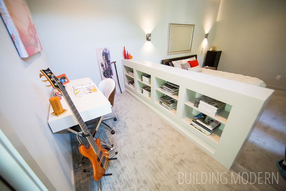
The master bedroom:
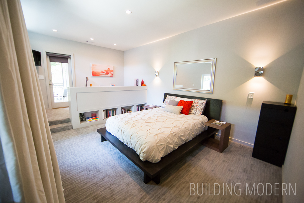
An additional office(?) nook in the bedroom. I’m not quite sure if the step up was due to some architectural reason or if this design was intentional – maybe to separate the space using different levels.
A little private two-person balcony off of the master bedroom.
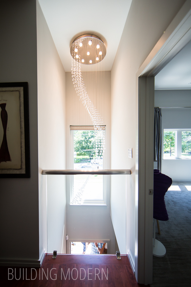
Back in the more public hallway section of the second floor, looking at the two-story foyer at the front of the house.
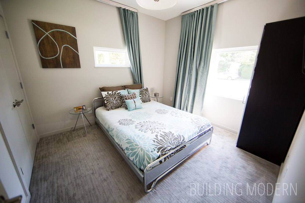
To the right is a sunny bedroom…
…and to the left, the hall turns to the matching bathroom & bedroom I was talking about earlier. Hey, it makes things simpler if you can run your plumbing straight down.
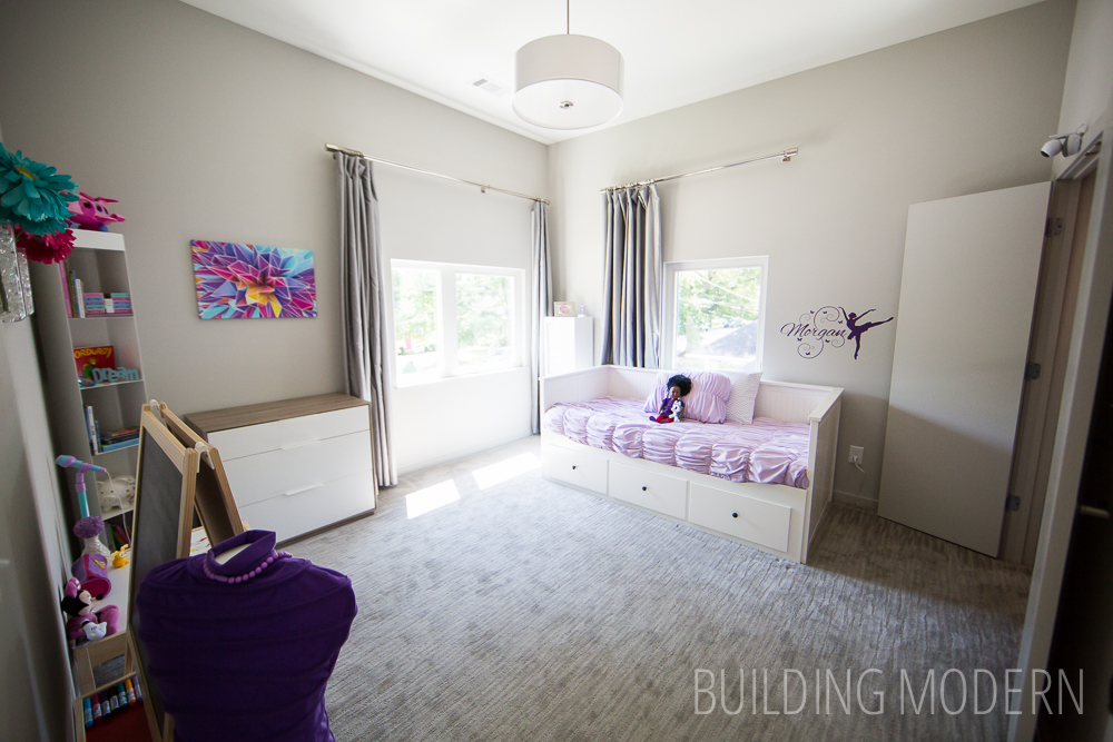
The baby’s room.
And back outside!