The Modern Atlanta Home Tour is a two day self-guided tour of homes in Atlanta. The architecture tour is mostly private residences, but occasionally a few commercial buildings are featured. It is usually held on a weekend in mid June – MA was founded in 2007. The tour is the finale of “Design is Human Week” – a week of speakers and events focusing on design, sustainability, and innovation.
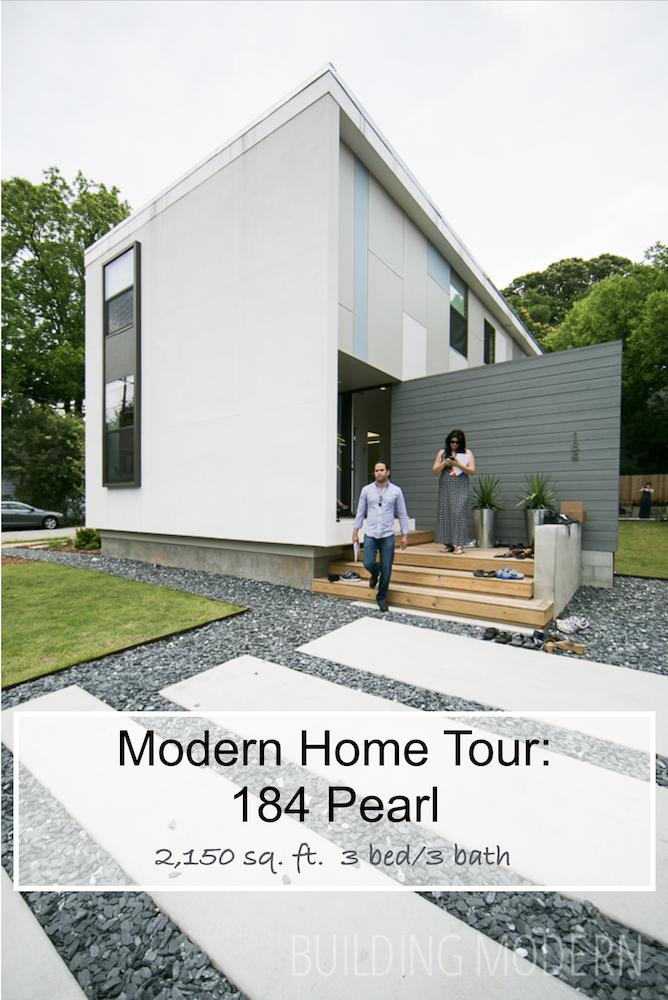
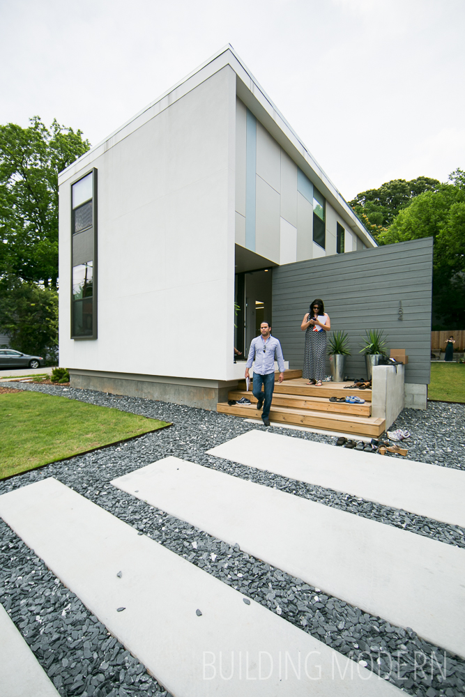
Project name: 184 Pearl
Location: 184 Pearl St. SE, Atlanta, Ga 30316
Architect: Brian Ahern & Jeff Darby of Darby Construction
Year Completed: 2012-2013
Square Footage: 2,150 sq ft.
Construction time: five months
184 Pearl is part of a set of three homes on the tour by the same architect: Described as “baby moderns” – all feature open living spaces & “unexpected” exterior spaces in common. 3 bed room, 3 bath. The tour book specifically sites: spray foam insulation and aluminum windows for energy efficiency. To create a modern aesthetic the houses use variable ceiling levels, flat roofs, concrete floors on the main level, random-width oak floors & minimal interior trim. Cementitious panels are used on the exterior. Local trades people sourced readily available materials, “making each home unique”. Each home boasts a “european kitchen”…. (aka, Ikea.) None of the homes had garages.
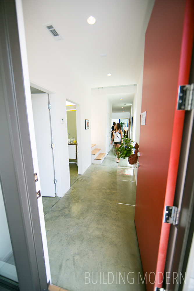
View as you enter the front door. First bedroom/office, bathroom, and stairs on the left. Farther beyond is the combination kitchen/dining/living room.
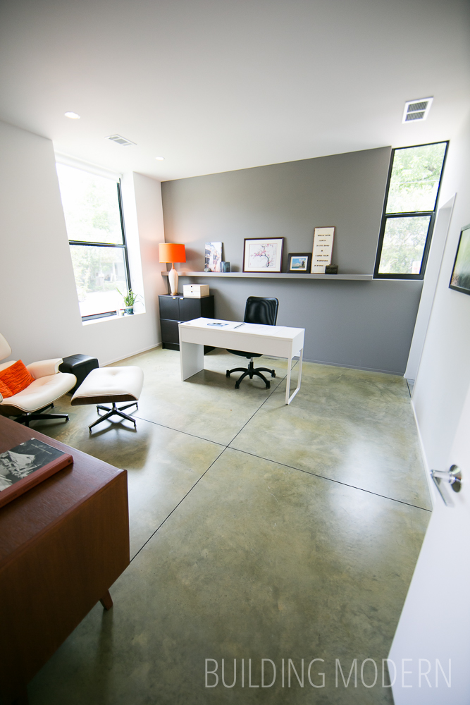
The first bedroom /office. Notice the windows and built-in shelf: I’m guessing, but it seems like this room was designed for the anticipated function rather than blatant window symmetry. A bed would work just as well in this space. On the right, notice that the door is famed with what looks more like just the door jam without a frame.
Wide windowsill detail. (Of course I’m a sucker for orange & grey.)

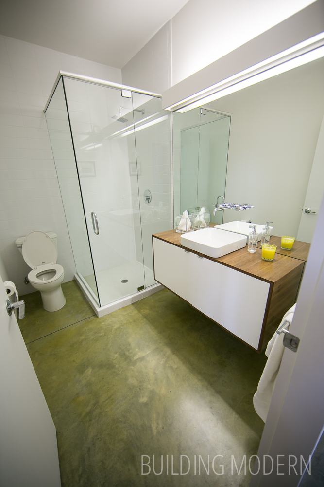
The downstairs bathroom. The green concrete floor, lack of window, & fluorescent light makes this room feel slightly basement-like to me (even though it’s not.)
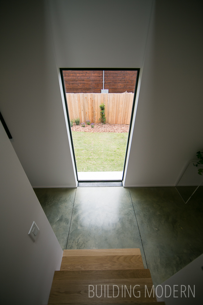
View at the base of the stairs in the hall. I like that the stairs terminate at a window instead of into a blank wall. Also, notice the very thin (like 1×2) baseboards. The fact that the relief lines in the concrete are not symmetrical with the window bugs me a bit – but its a minor detail. I would totally plant a feature Japanese maple outside that window. I love the concept of framing a purposeful view through window placement.
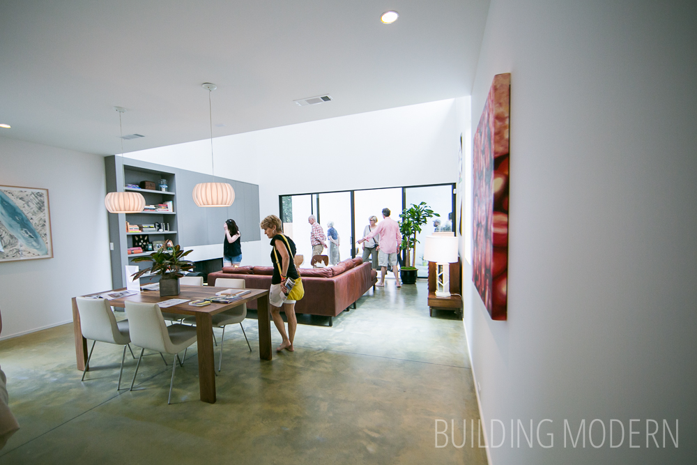
Still on the first floor, passing the stairs into the kitchen, dining, living room.
Turning around to the left to see the kitchen. The Sofielund walnut-effect & Abstrakt high-gloss-white doors is a nice combination. The refrigerator is hidden in the pantry around the other corner.
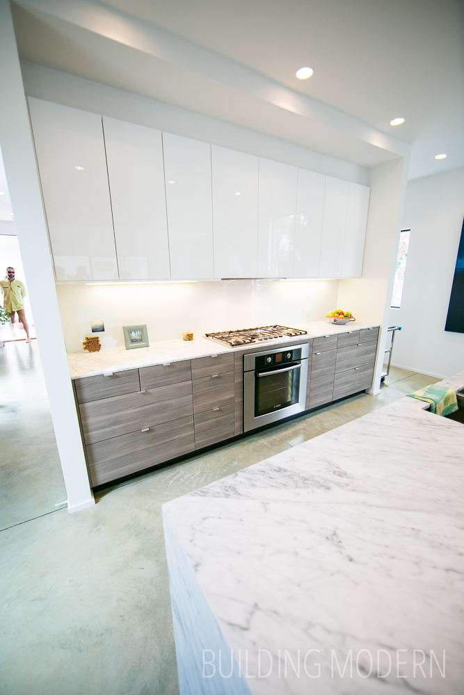
The pantry with refrigerator tucked behind the main kitchen wall.

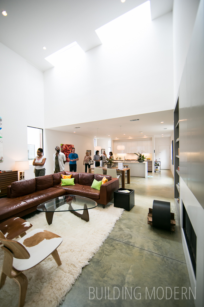
The living room opens up to a full two-story height – looking back toward the dining room & kitchen. Those skylights let in a considerable amount of light.
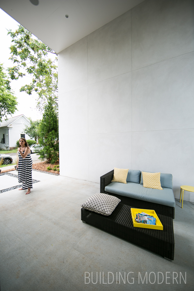
View of the back of the house from the exterior space.

Turning back around – this space is covered by the roof and the wall provides privacy & a connection with the rest of the house… it’s a lot of concrete-like material though.
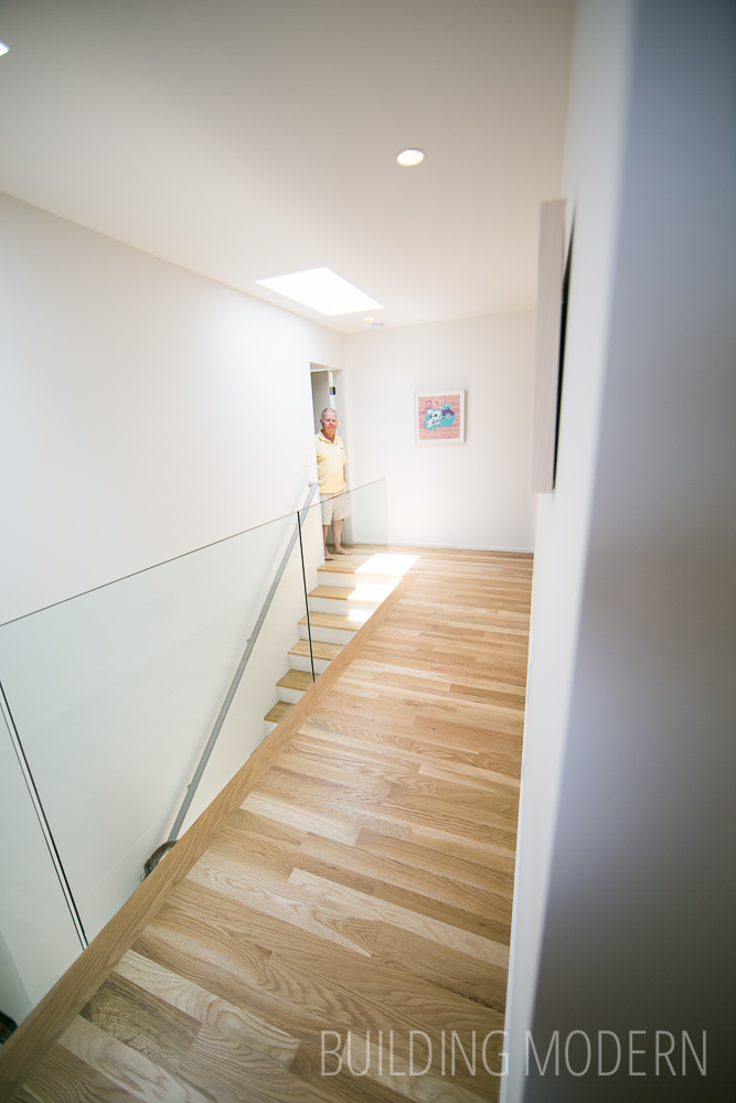
Back inside, at the top of the stairs – again, more sky lights. As a side note, I noticed a lot of light colored flooring on this year’s tour – mainly white oak in many of the houses.
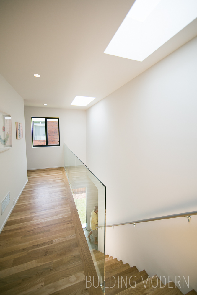
Doors to the bedrooms are at either end to the hall. I like how this rectangular house is bisected on the second floor by the stairs… additionally, this hall creates a buffer between the bedrooms as well.
The second bedroom. It’s pretty much a box.

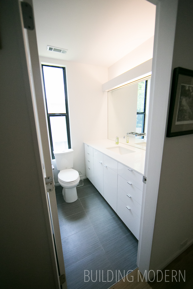
Guest bathroom – more high gloss white cabinets. The gray tile wasn’t a bad choice at all.
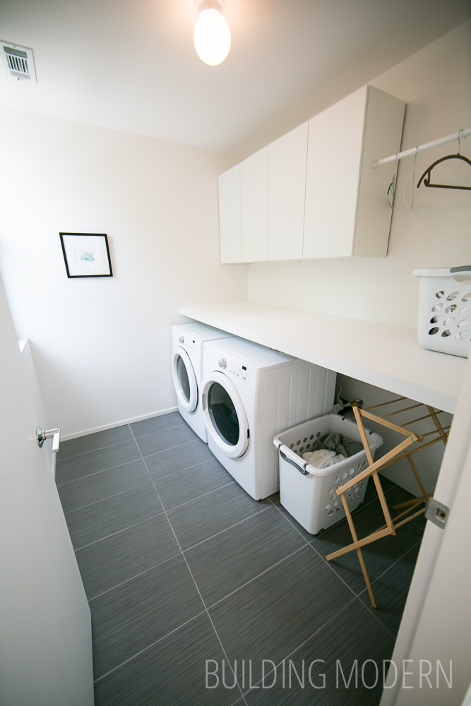
A laundry room with a window and extra space is always nice.
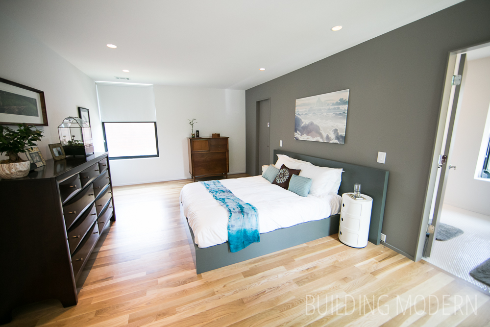
The master bedroom.
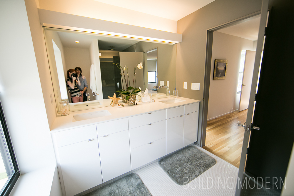
The master bathroom. High gloss white cabinets, white penny round tile, and wall-mounted faucets. All the bathrooms had full wall mirrors – this was interesting to see since lately, people have been pulling these out in favor of smaller “picture frame” style mirrors. In this setting, however, the mirrors seem minimal and less distracting.
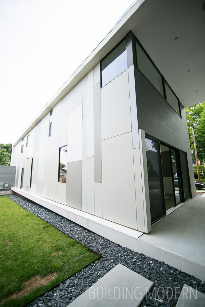
A wider view of he rear of the house – the placement of the siding panels makes the seemingly randomness of the windows make more sense and purposeful on the exterior.
It was nice to see the commonalities and differences between the three Pearl houses. Seeing the “unexpected” exterior spaces that were common to all three of these houses together, really demonstrated that this concept was a priority to the architect. The description of “baby moderns” was a good choice of words: these houses did feel tight compared to other modern houses, despite all being around 2,000 sq ft. (which, I normally wouldn’t describe as “tight”.) The size felt ample for a regular house, yet smallish for the modern style. (Well, perhaps not 184 Pearl, but yes to 200 pearl.) Some larger homes on the tour have a separate dedicated office in addition to the bedrooms, whereas homes around the 2,000 sq ft. mark (like the Pearl homes) were using the third bedroom as an office.
Up next: the other two Pearl residences and more homes on the tour!