Prior to actually designing the layout for our actual kitchen (as in the house we bought), Spencer and I had first designed the layout in our imaginary modern house (we one we thought we might build). So, because of this, we had already asked ourselves “what makes a kitchen modern? What makes it feel open and not cramped (aside from square footage alone)?”
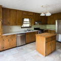
As for this kitchen’s layout, it turns out that the existing placement of the appliances seemed to be the best placement for the room. This fact just made our job waaaay easer.
This meant no messing with plumbing or moving major electrical. We did, however, scooch the fridge over a bit – but that didn’t affect any behind-the-scenes stuff.
Regarding the island position, something that we picked up from observing houses on the Modern Atlanta home tour was the spacing between cabinets. By this, I mean the space between the island and the cabinets against the wall. What we observed on the tour (and also in the ikea showroom) was that approximately a four foot wide walking space felt more luxurious. We also took into consideration the “swivel room” for taking something out of the fridge and setting it on the island. More importantly, though, was the walking space between the island chairs and the wall with all the doors – we needed to make sure there was enough clearance with the chairs pulled out.
We came up with a few obvious aesthetic things such as the decision to go with Ikea cabinets, accent lighting, and other major finishings (as in countertops, flooring, & backsplash tile.) But more on finishings later – back to layout!
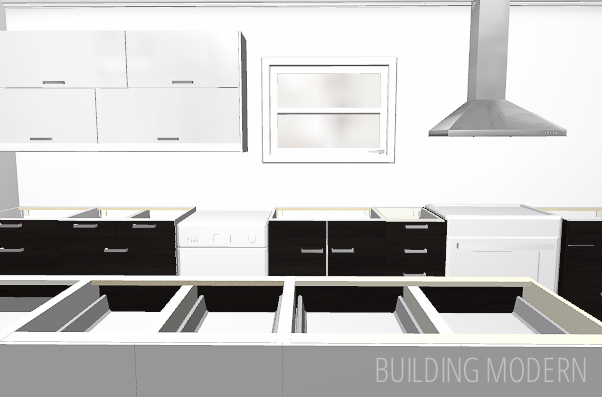
Here’s an overhead view of the new cabinet placement:


Initially, I knew I wanted drawers for storage. I am assuming cabinet dimensions have been somewhat consistent over time, because (for this wall) the Ikea cabinets almost picked themselves. I had a few inches of appliance wiggle room, but I had to follow some basic rules like “there must be 18 inches of countertop space between the oven and any other thing” (the sink in our case)…and the sink cabinet was already a specific size (cabinet #3). To the left of the dish washer only two cabinet sizes would work in this space. Actual decisions needed to be made for the space to the right of the oven (cabinet #5).
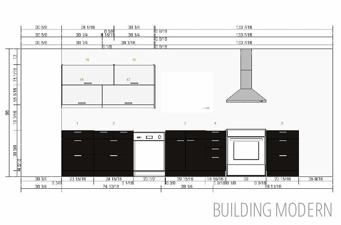
To keep things more modern looking, we decided that we liked the horizontal upper cabinets. I staggered them to make them look a bit more unique. We also decided on a large open wall space – an area that isn’t crowded with lots of upper cabinets. I know a lot of people are currently removing upper cabinets and replacing them with open shelves, and we like the look. Hopefully, “light and airy” will not look dated in a few years. We were also planning on tiling this entire wall for a dramatic affect.
The space to the right of the oven was affected by what was going on the the refrigerator wall. After looking at some displays at Ikea, we wanted a “tall cabinet” that wrapped around the fridge.

I wasn’t a fan of those lazy susan corner cabinets – they always seemed dirty/creepy so we left the space in the corner empty and fit an appropriately sized cabinet between the oven and that nothing-space. (which would be supported & covered by counter.) I had to be careful that there was enough clearance for the Gnosjo drawers to open and also for the white Abstrakt tall cabinet door to open fully. If the tall cabinet door couldn’t open completely, then the drawers inside wouldn’t be able to be pulled out at all.
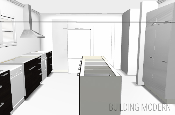
The plan from the beginning was to remove the existing pantry (a wall with louvered bifold doors) and replace it with two shallow “tall cabinets”. We should have the same, if not more usable storage in a more compact space.
Keeping function in mind as we designed the layout, cabinets #14 & #13 are for pots, dishes, and silverware. Cabinet #12 will be a pull-out trash can. We also needed to consider the size of countertop we would be pouring for the island as well.
This rendering isn’t perfect: the door to the basement actually isn’t inset like this (on the left).

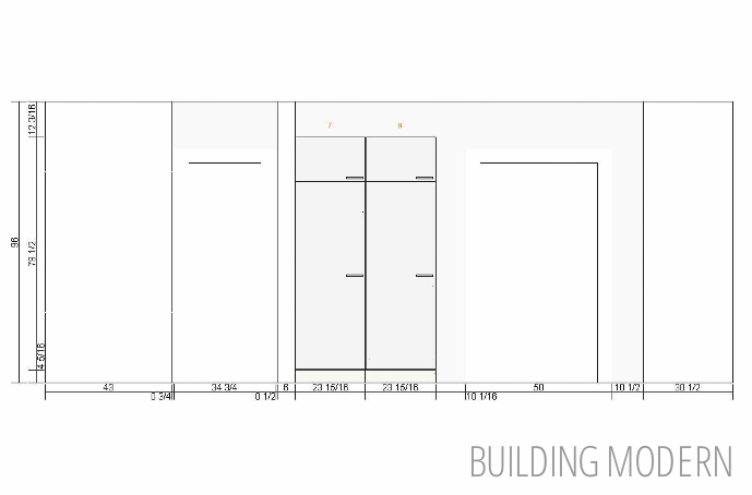
For this wall…more cabinets!
In the original layout, this space was left open for a eat-in table. We decided that more storage was better (especially since we don’t have a huge amount of upper cabinets) – a current trend in kitchens is seating at the island (which is what we were doing), so we didn’t need a table space. These cabinets would have shelves + doors for small appliance storage. Additionally, since the cabinets didn’t quite match the depth of the two flanking walls, we will pour the countertop so that there is a slight overhang. This space doubles as more storage and as a place for a computer/ work space.
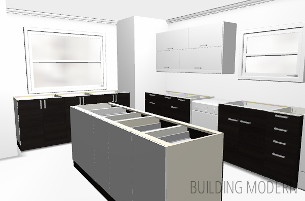
Views from the four corners of the room:
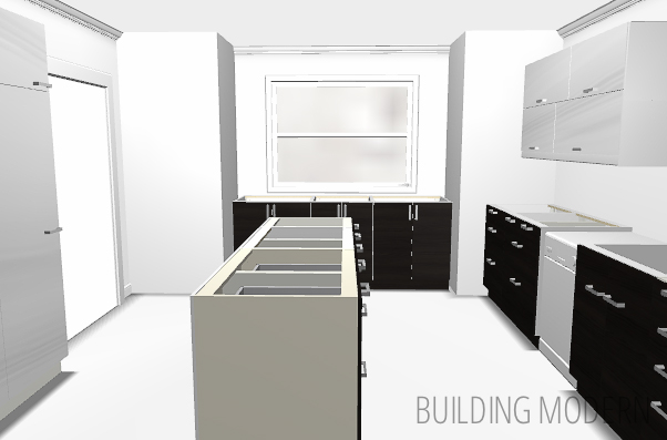
View from the foyer door:
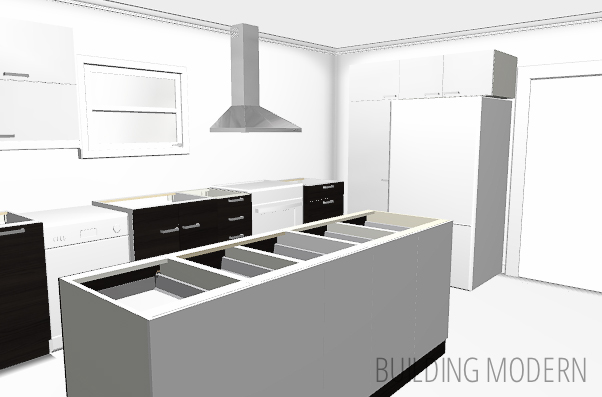
Looking toward the dining room with the doors to the basement & foyer on the right:
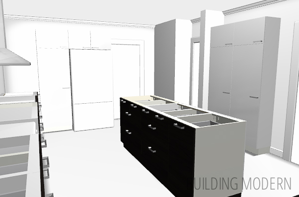
View looking toward the foyer door & window at the front of the house:
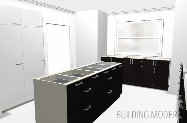
View from the dining room door:
Oh, all of these renderings were done in the Ikea 3D kitchen design tool, by the way.