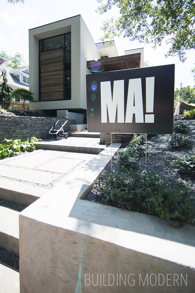
The Modern Atlanta Home Tour is a two day self-guided tour of homes in Atlanta. The architecture tour is mostly private residences, but occasionally a few commercial buildings are featured. It is usually held on a weekend in mid June – MA was founded in 2007. The tour is the finale of “Design is Human Week” – a week of speakers and events focusing on design, sustainability, and innovation.
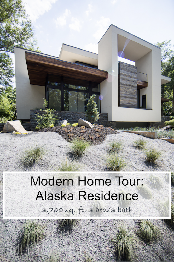
Project: Alaska Residence
Location: 282 Alaska Avenue Atlanta, GA 30312
Architect: West Architecture Studio
General Contractor: Principle Builders Group
Landscape: Brendan Butler Landscape + Design
Square Footage: 3,700 sq ft.
3 levels:
– basement: finished room, garage
– kitchen, dining room, living room, office nook, bathroom, bedroom
– living room, 2 decks, master bedroom, master bath, bedroom, bathroom
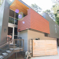
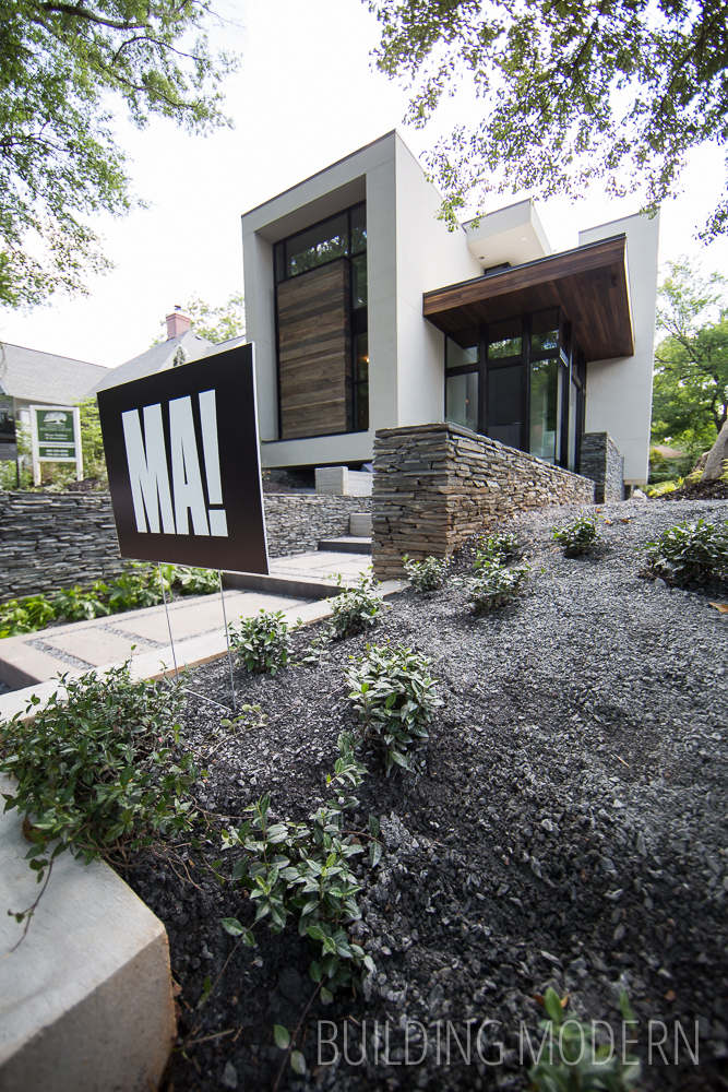
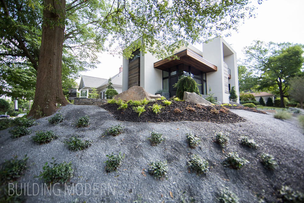
The property sits on a corner, here is one street view of the home:
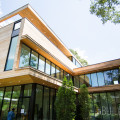
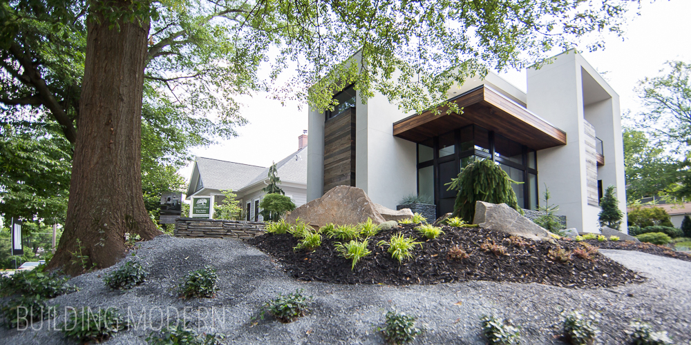
Another street view from the approach. The stucco, glass, and wood exterior with concrete and stone retaining walls:
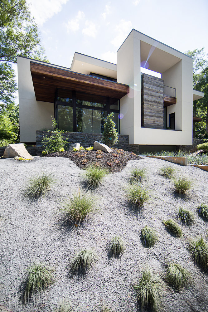
Canterlieverd sections with stone and rough cast concrete walls:
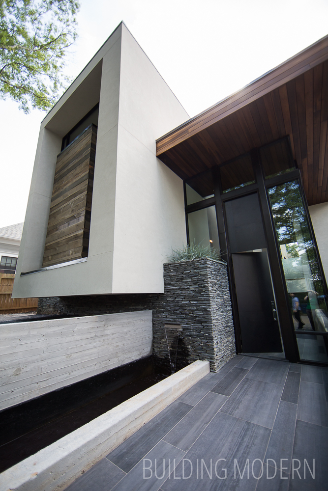
A water feature spills into the linear pond:

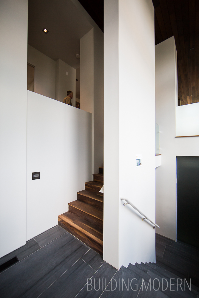
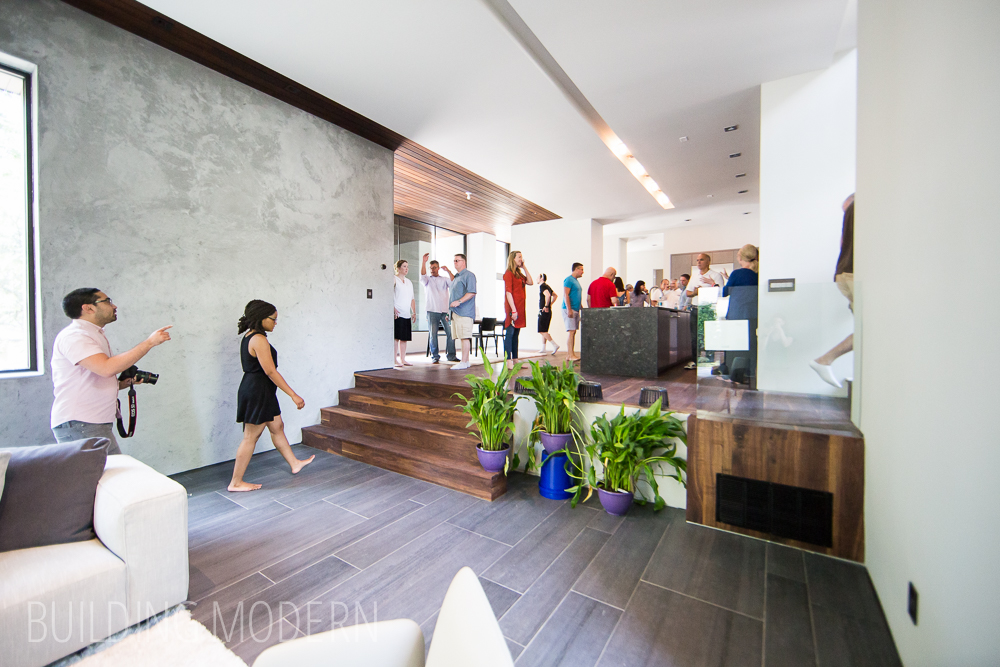
The split foyer with tile going down stairs and walnut treads upstairs:
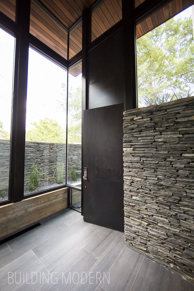
Looking back a the glass walls and metal front door:
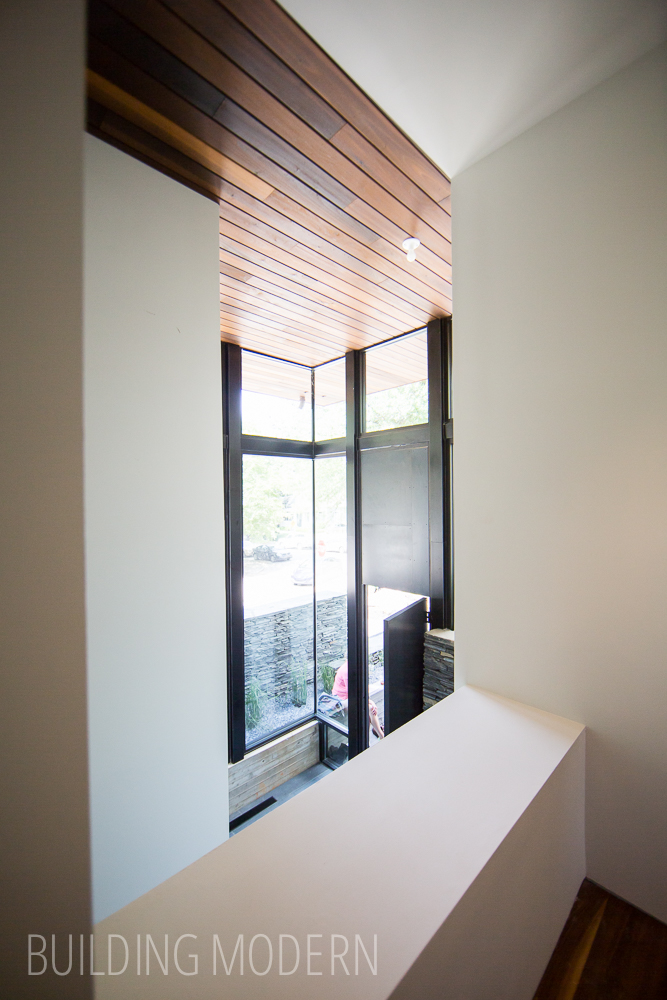
Walnut stair risers and treads sandwiched between walls:

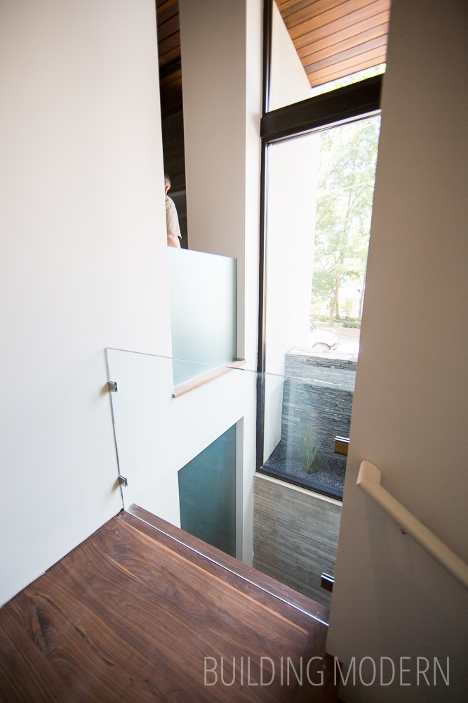
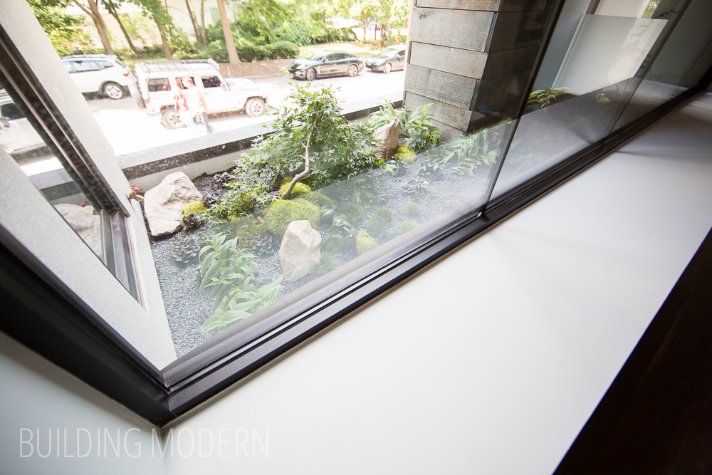
A glass safety partition allows for light and uninterrupted sight lines. Through the window, you can see a planting space that can only be seen from the interior of the home.
You are immediately greeted with the kitchen on the left (still unfinished). Behind the back kitchen wall, near the window, is the pantry:
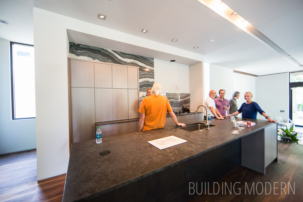
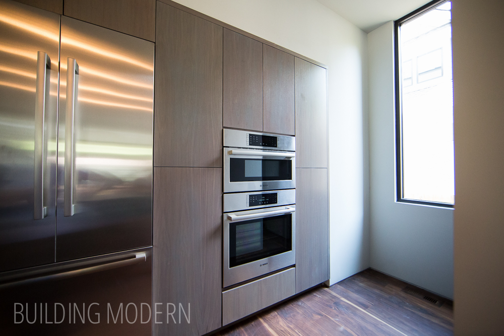
Looking from another angle to see the far wall with the refrigerator and oven. From this view, the step up on the right side, are the stairs to the second floor. I have seen this in a few homes, and I am really starting to like the stairs tucked behind the kitchen concept. Check out the solid finished-in-place walnut floor. Now that we have our own pre-finished solid walnut flooring in our home, seeing a home like this (and a few others) makes me realize that finishing the floor in place really does make a difference. I prefer the smooth surface without bevels between boards and the matte finish – something that doesn’t seem to be available in a pre-finished product.

Turning around, so that the foyer is on the left, is a short hallway:
View of the foyer from the hallway:
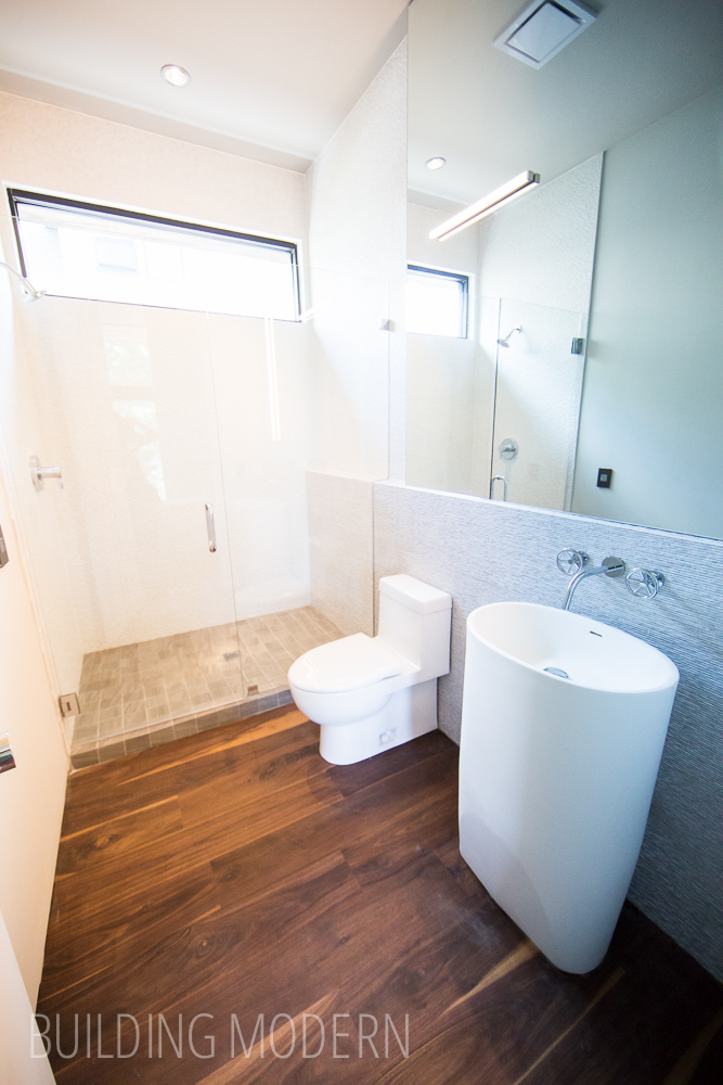
Guest full bathroom. Solid wood floors in a full bathroom is brave.
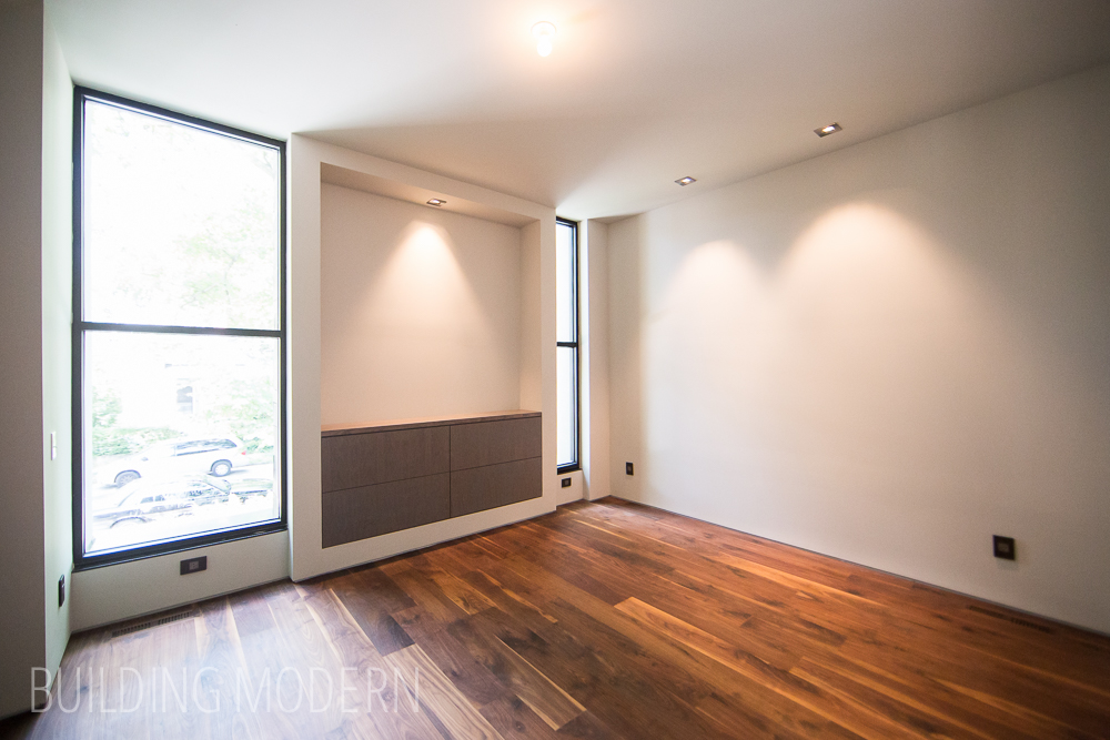
First floor bedroom. Like many of the storage spaces/closets/built-ins in this home, the units actually protrude on the exterior. They take little floor space away from the room itself. You’ll see more extreme versions of this later. It really reminds me of our master bedroom closet, which does the exact same thing – just a 1980’s version.
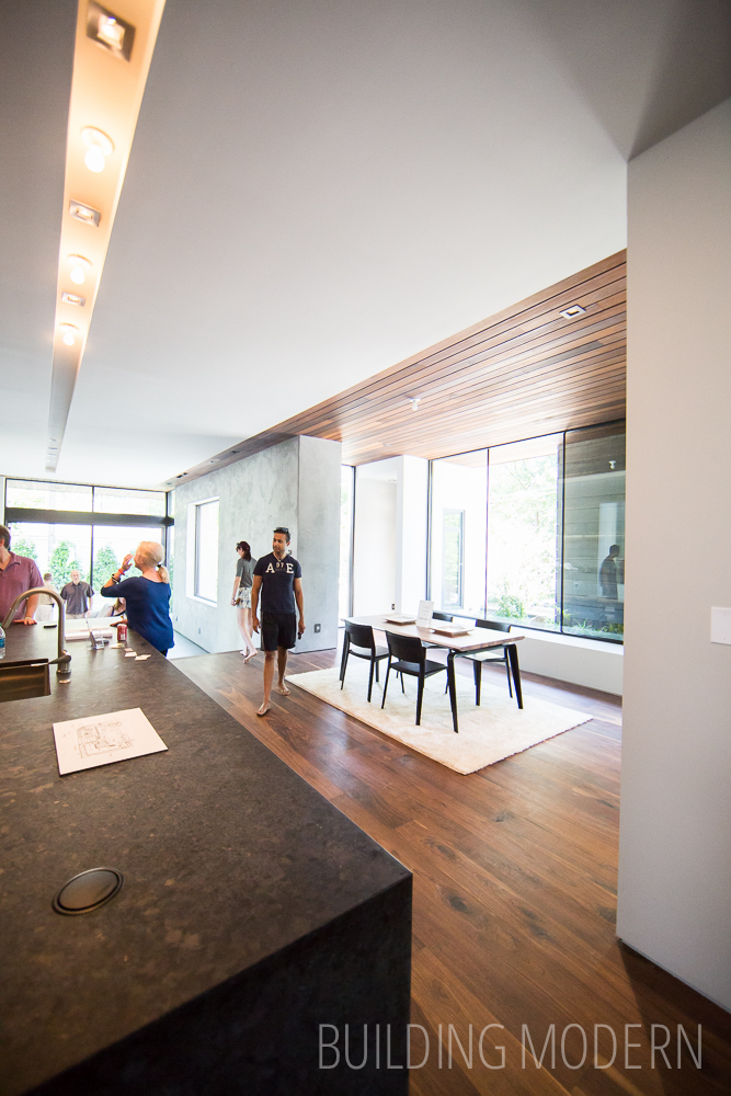
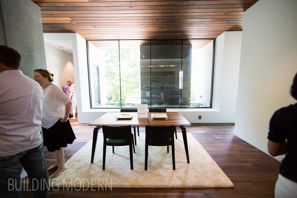
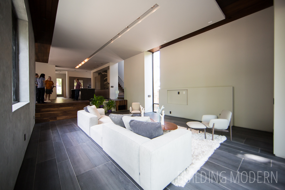
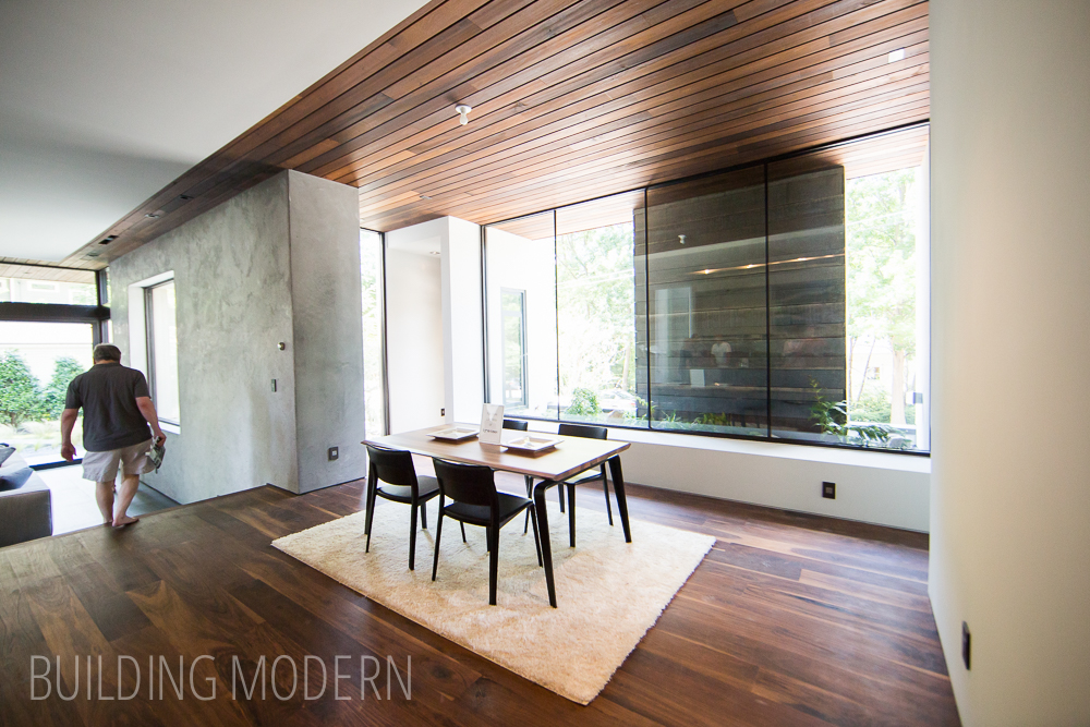
Looking back from the little hallway to the kitchen (left), dining space (right), and sunken living room (background). “Sunken living room” also sounds very ’70’s… is this house a modern ’70’s/’80’s update concept challenge? If so, they did a great job! Another detail: split ceiling treatment – drywall and wood.
Dining room with a view of a private planter and weird nook on the far back left:
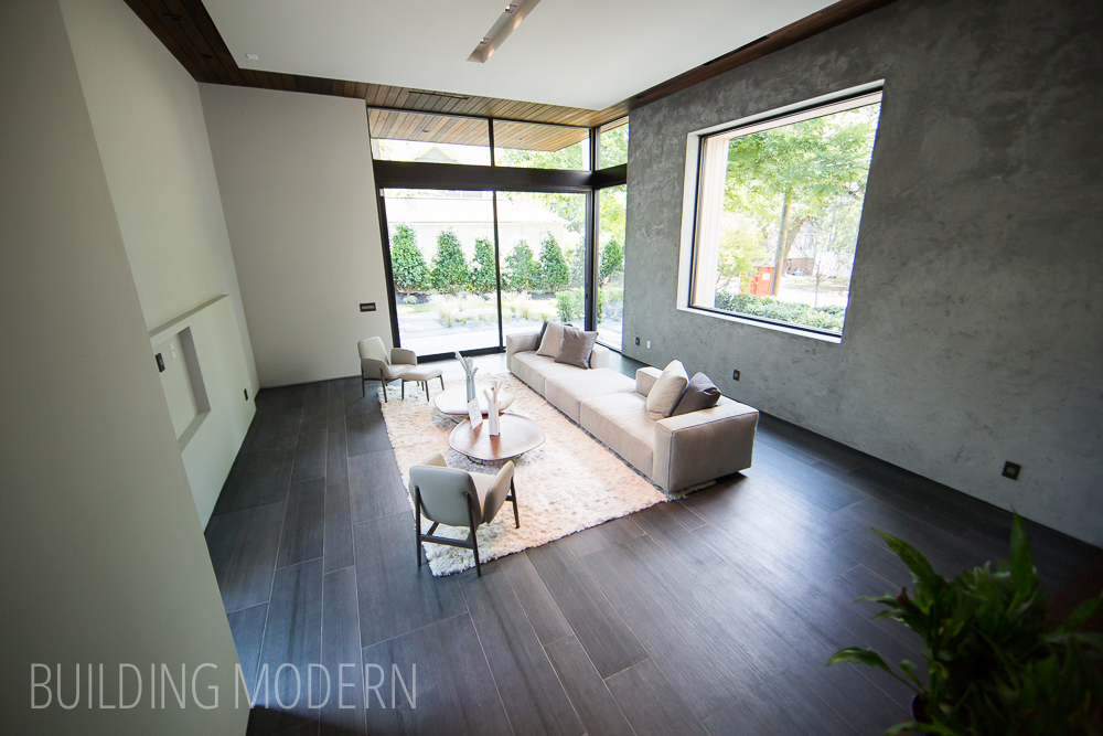
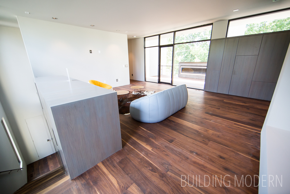
A look down to the sunken living room. I like how the level change breaks up the space. Notice how the wood treatment on the ceiling wraps around and frames the room and is also continued seamlessly outside though the glass – joining the spaces.
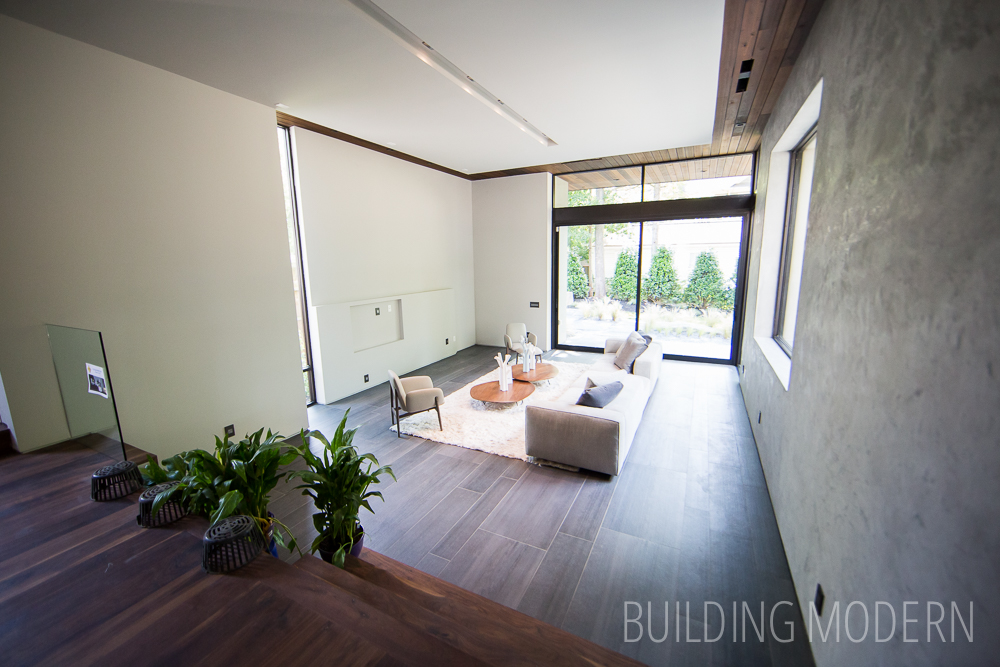
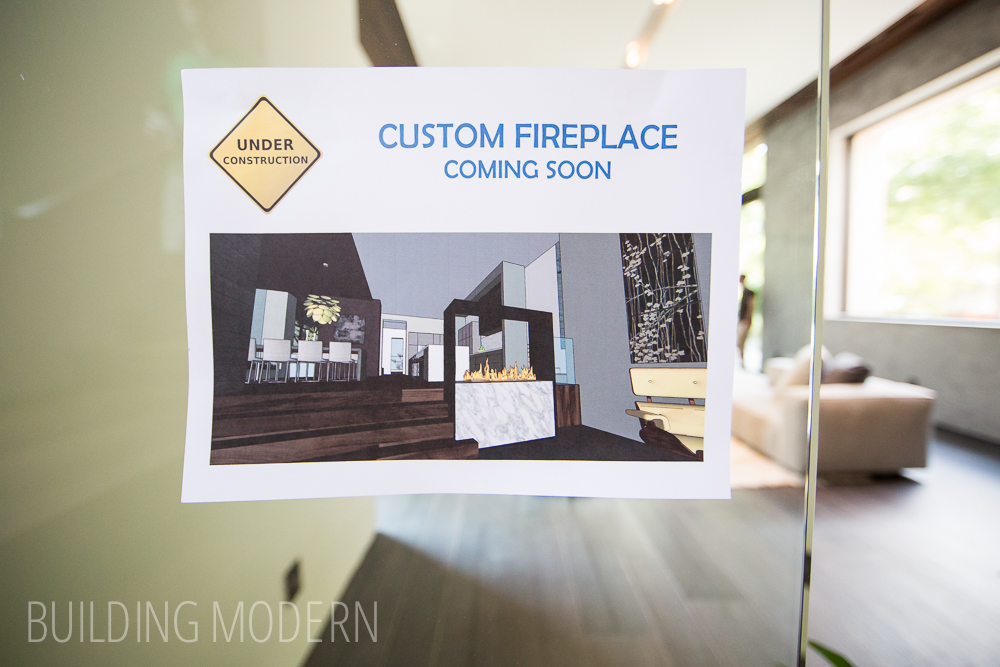
I really like the big giant fixed window in the plaster-looking finished concrete wall.
Nest and Legrand:

View to the outside – the same flooring material is continued outside, just like the ceiling:
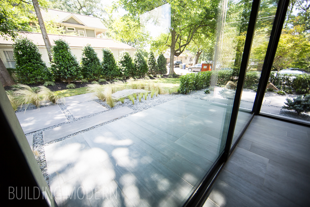
Enough space to enjoy without too much maintenance:
I do like rectilinear garden structure with the soft forms of the plants:
Looking back:
Some elements are still unfinished:
Dining room again:
The small bed for the home owners to enjoy:
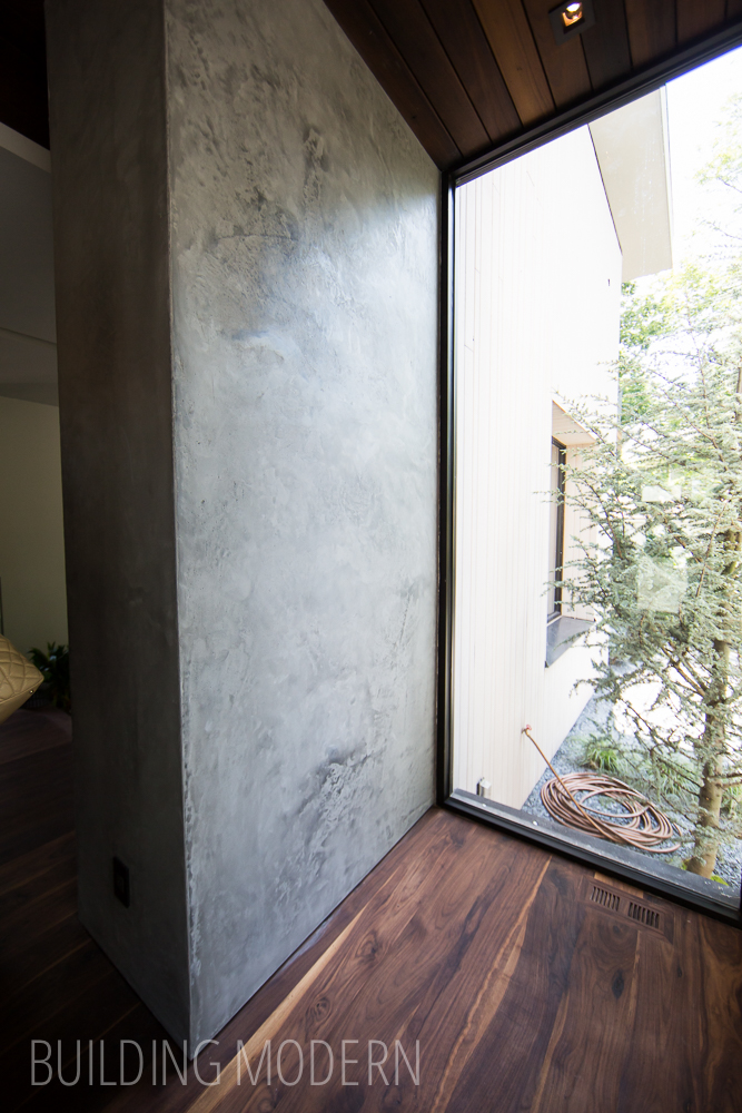
Concrete, wood, and glass:
Nook off of the dining space:
Window access to the planter:

Upstairs (behind the kitchen):

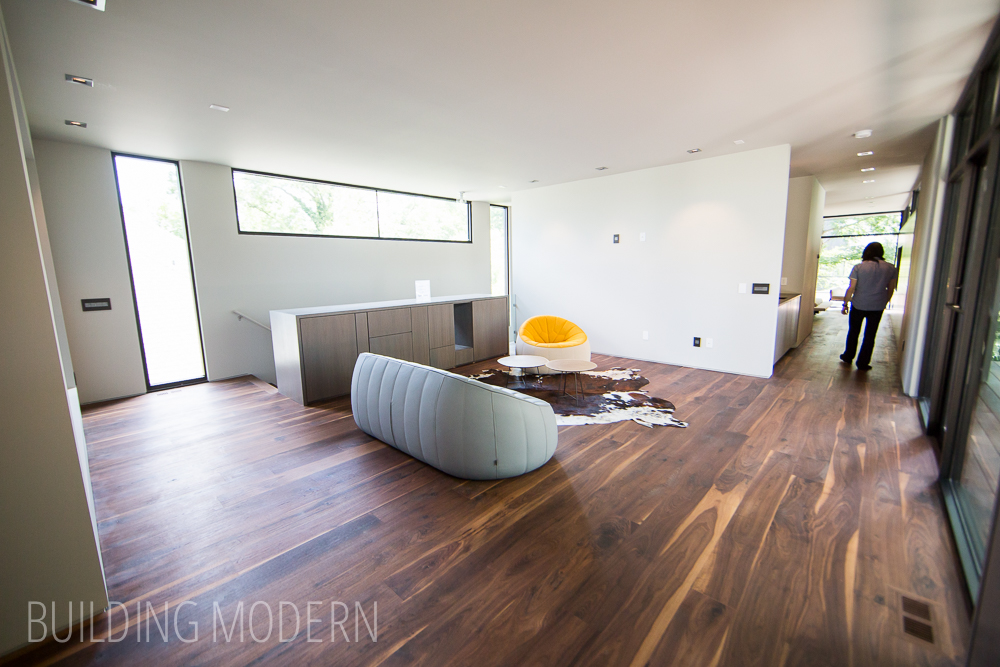
A built-in cabinet serves as a partition so no railing is needed in the upper living room:
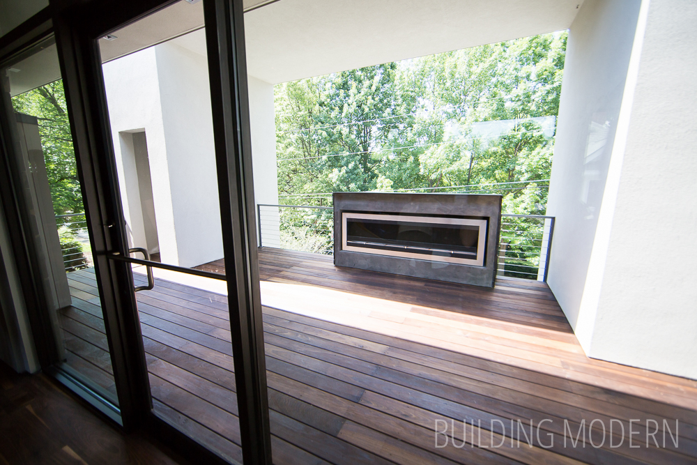
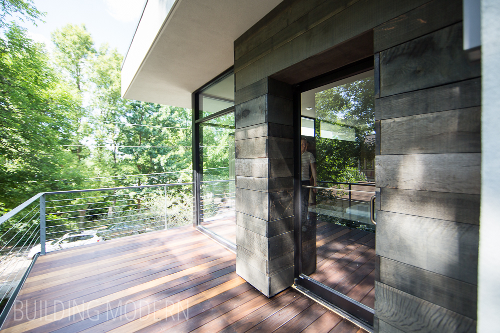
Deck off of the living room:
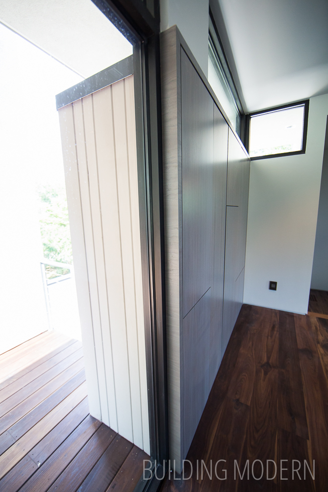
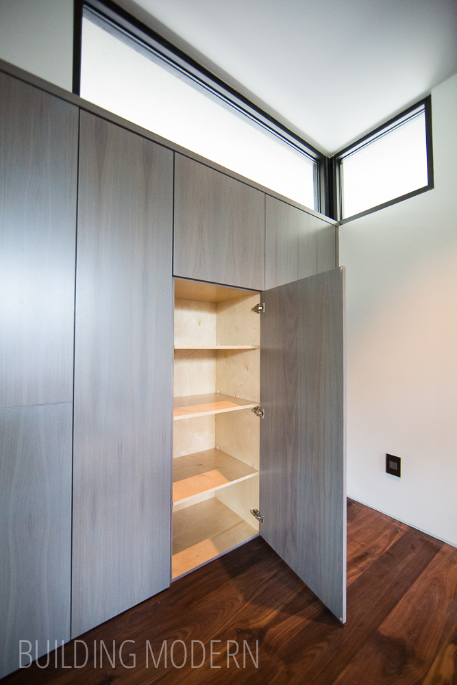
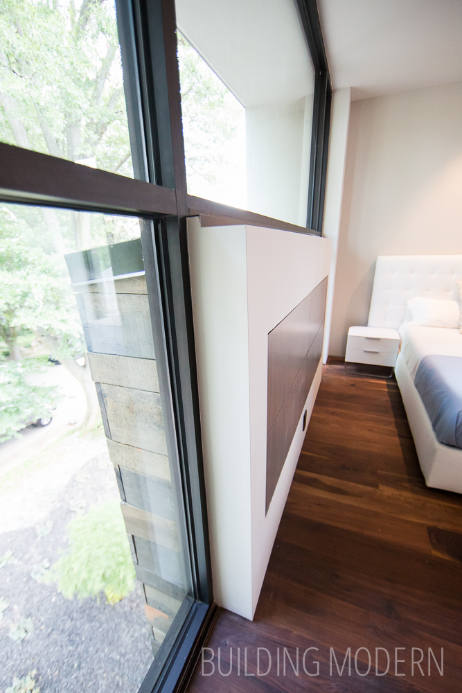
Another example of the cabinetry utilizing exterior space:
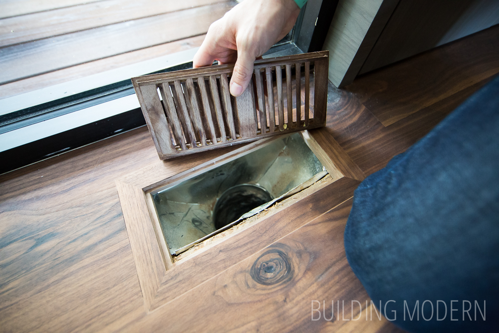
Vent covers made of the same flooring wood in order to blend in:

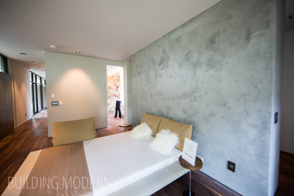
The master suite is on one side of the living room, and behind the camera, is a short landing which leads to another bathroom & bedroom.
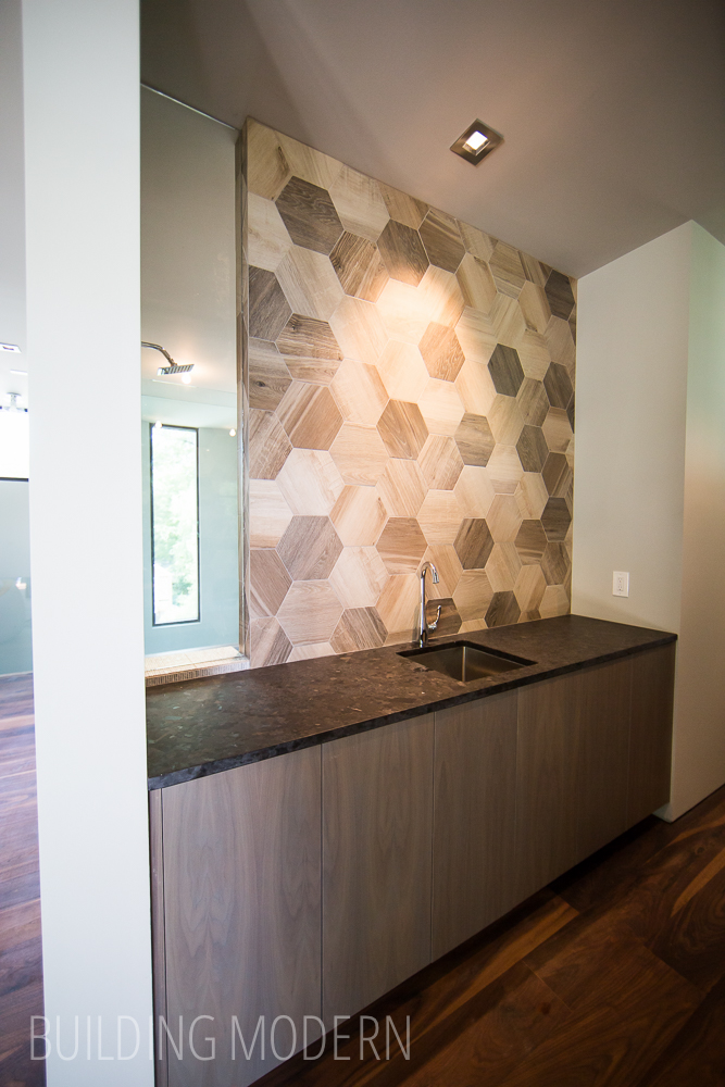
Passing by a wet bar with a window into the shower:

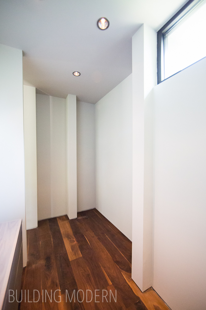
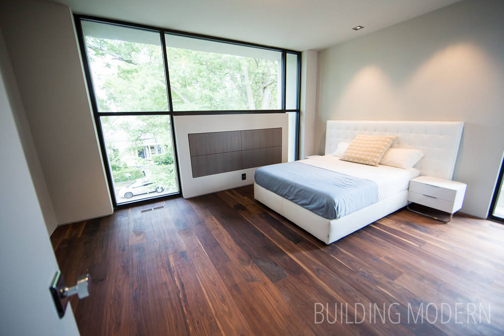
Master bedroom with the bed against the wall that holds a walk around closet. When we were planning to build a house, this was a concept we were definitely going to incorporate. A similar idea, can be seen in Custer House, which was on the 2014 tour.
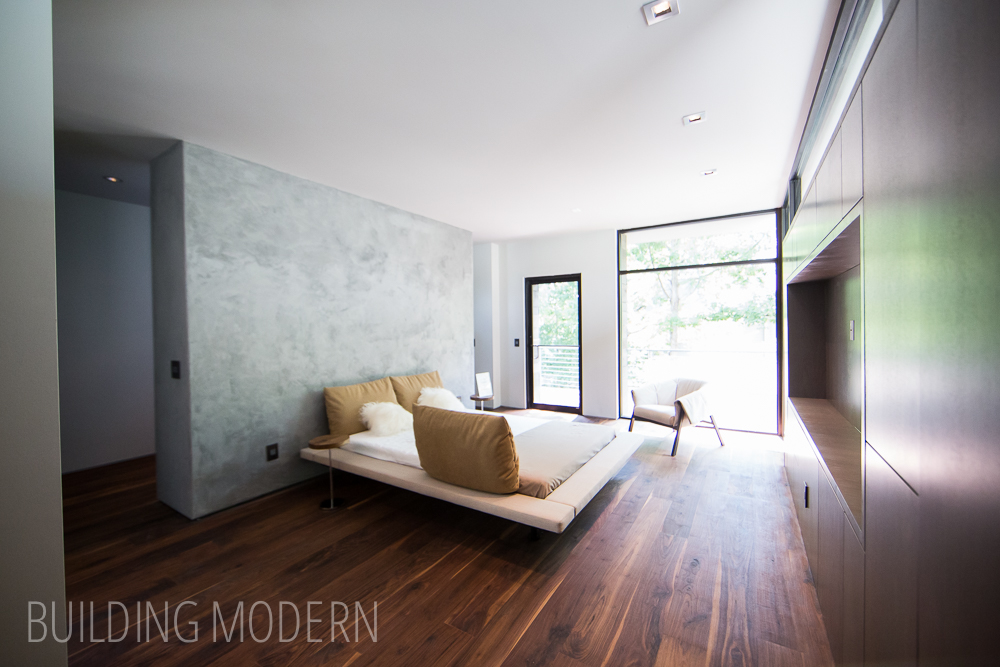
The closet with pillars specifically placed (it seems like) for clothing rod termination points.
Looking back toward the living space and into the master bathroom:
Sink coming soon!
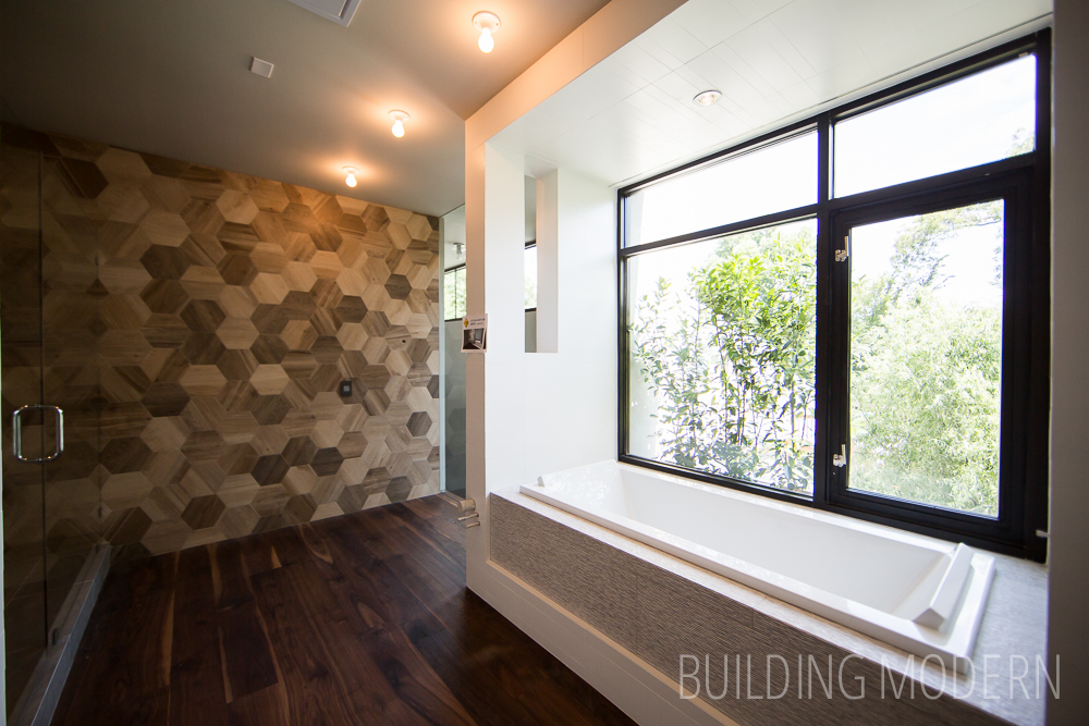
An interesting mix of a white/grey palette and brown tones:
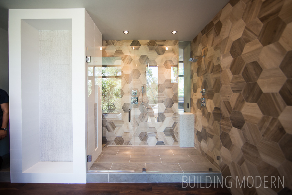
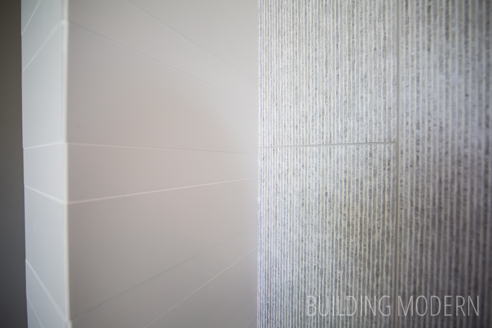
Tiles with texture:
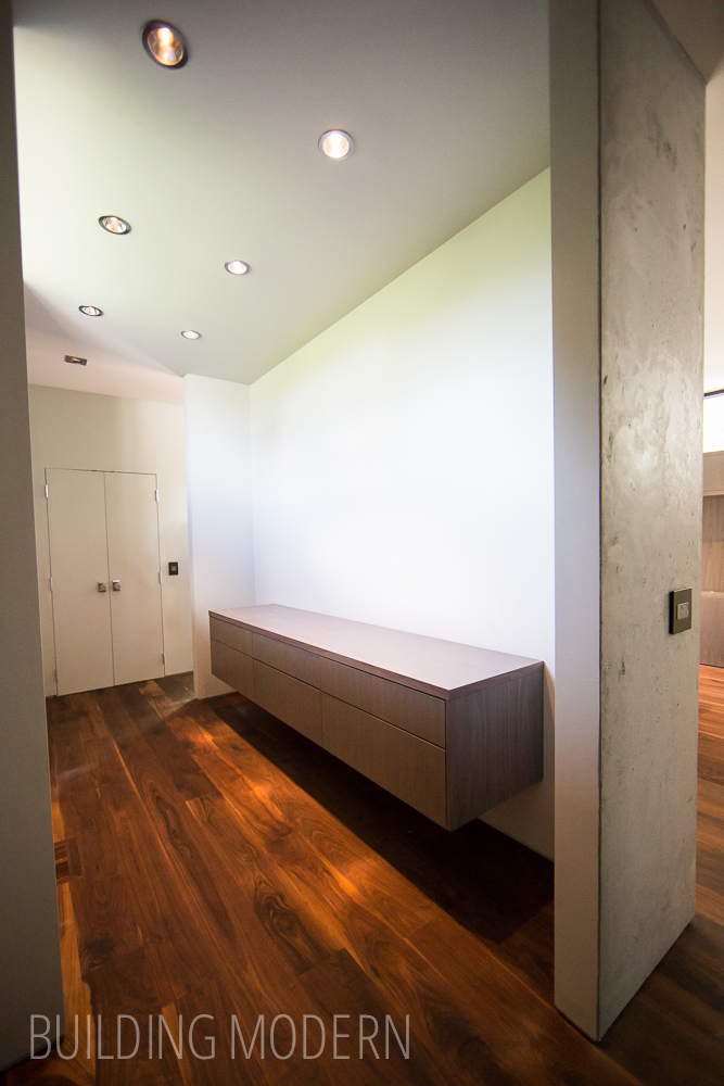
The whole wall of cabinets is another box-protrusion on the exterior:

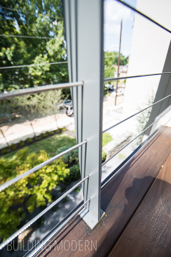
The master deck:
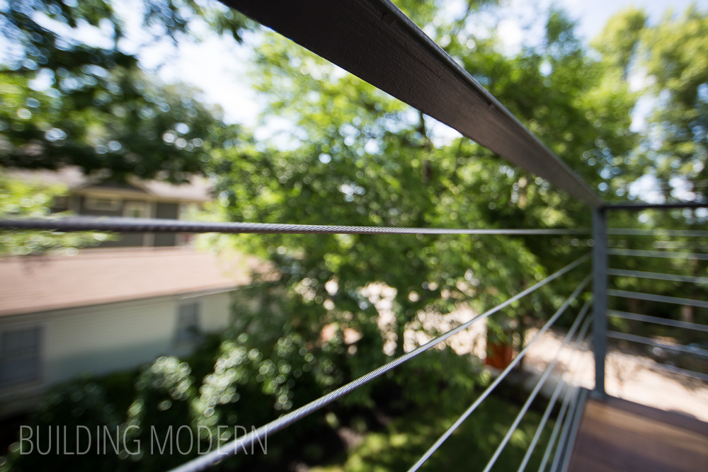
Metal bar and cable railings:
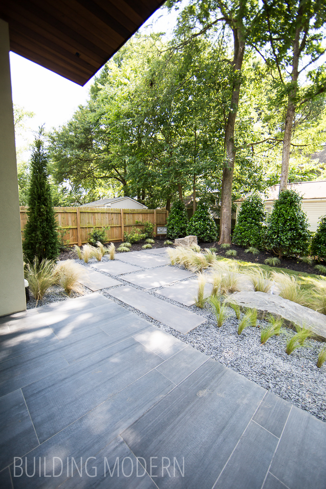
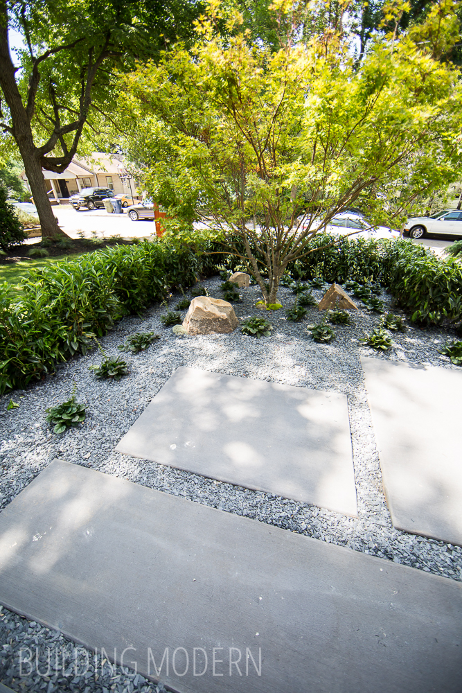
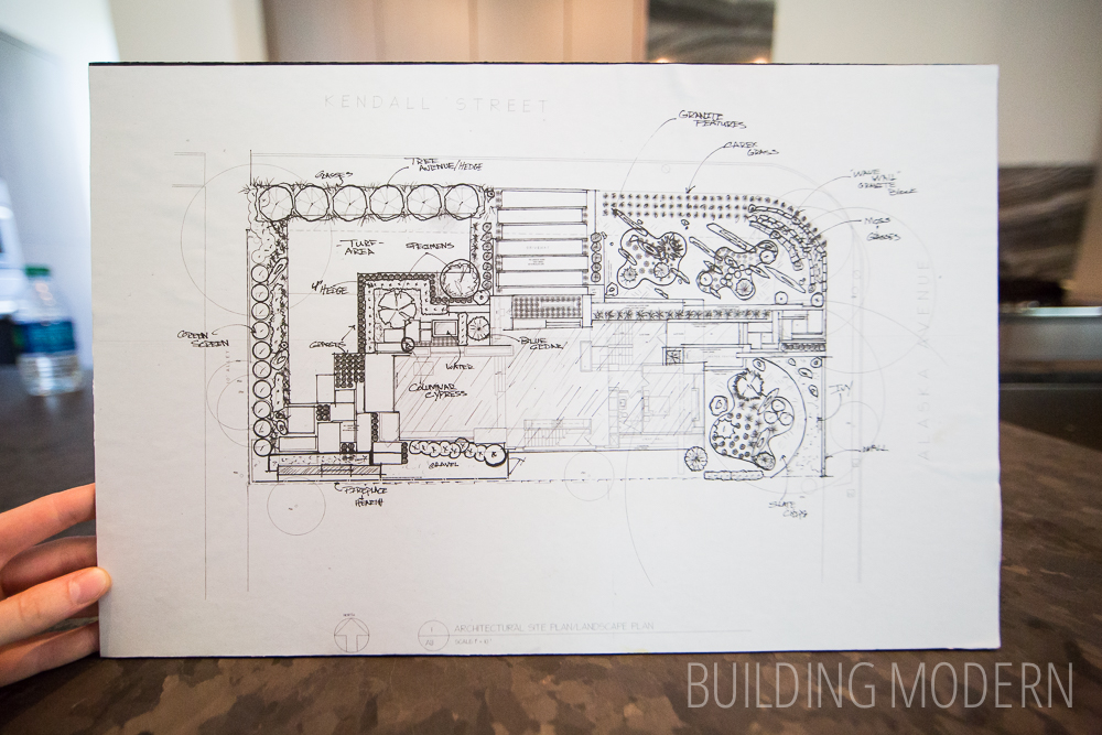
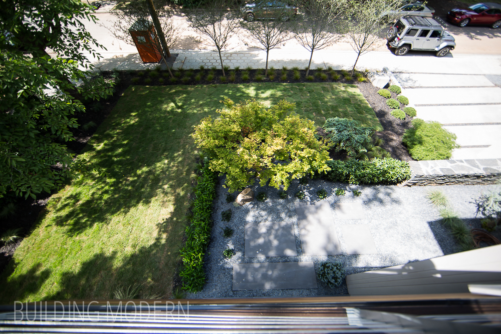
The landscape plan:
View of the upper living room from the master suite:

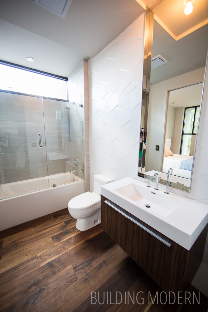
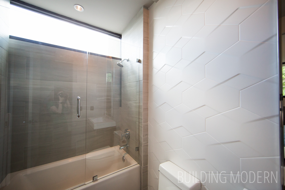
A few steps down to the landing with a bath & bedroom:
Bathroom with a cool textured tile:
Bedroom:
Indoor/outdoor drawers:
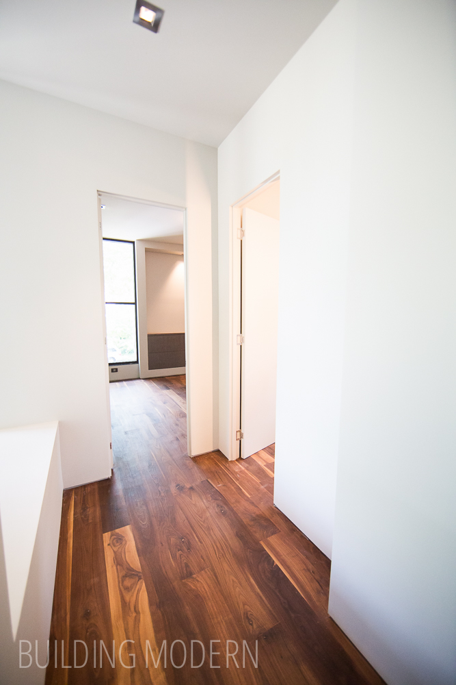
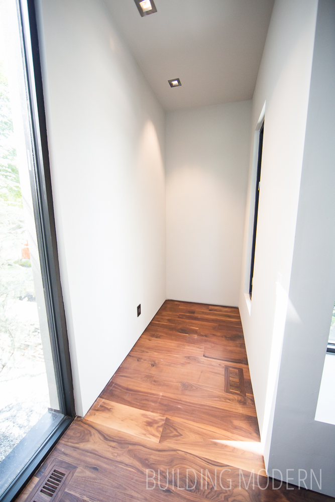
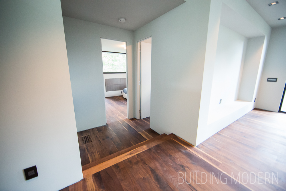
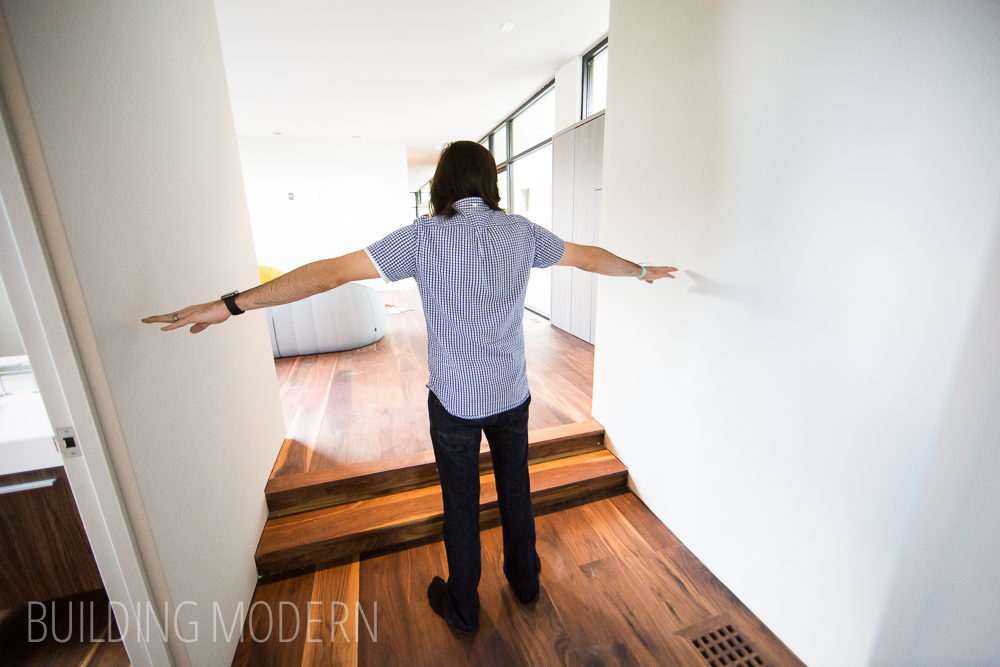
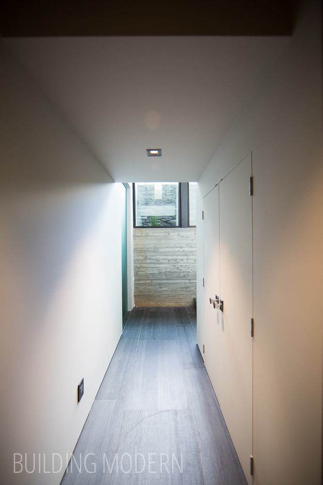
Spencer demonstrating a nice width to the hallway:
Starting at the beginning – the foyer, but going down to the basement this time:

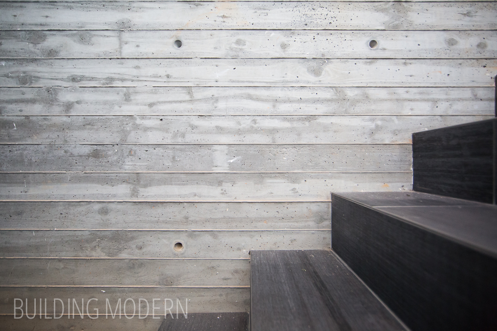
Raw wood plank cast concrete:
Walking backwards down the basement hall:
The garage, nothing fancy. It does have a window though.

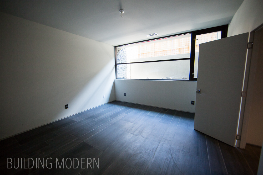
A finished basement room:
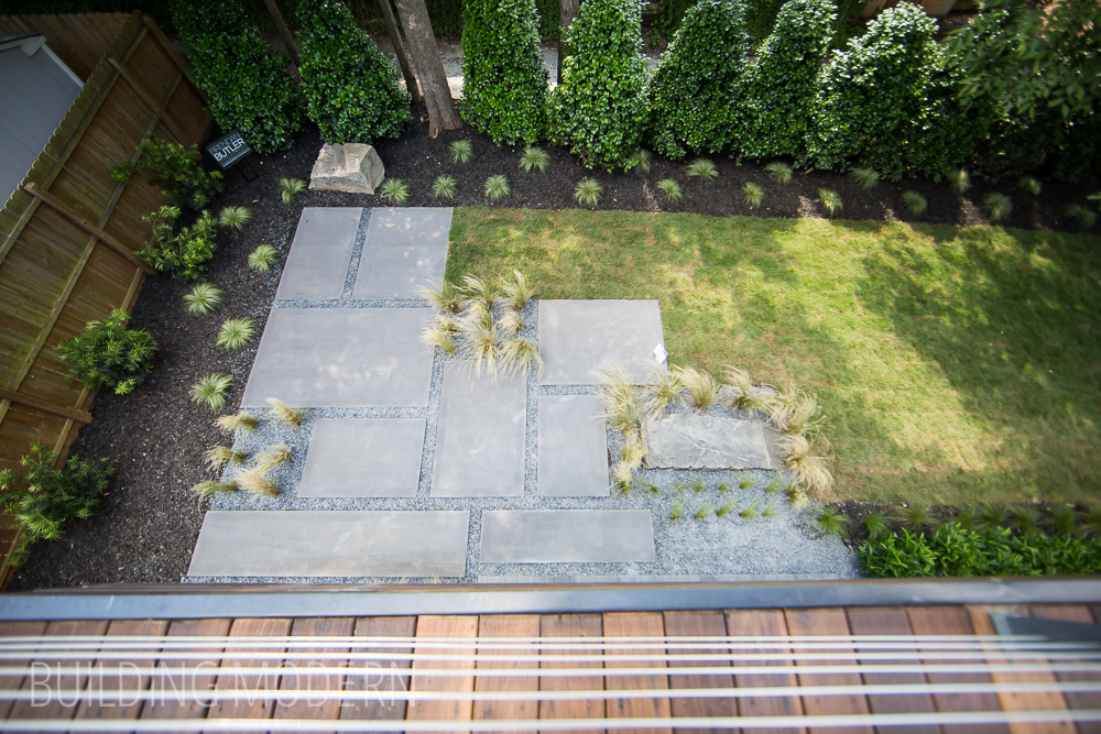
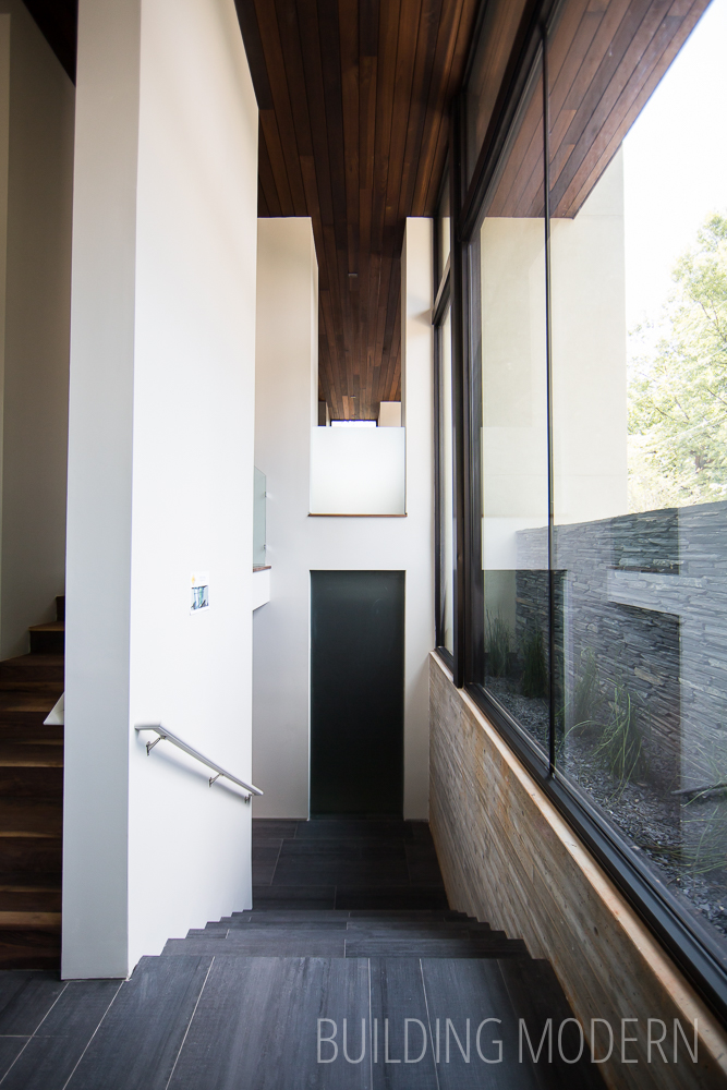
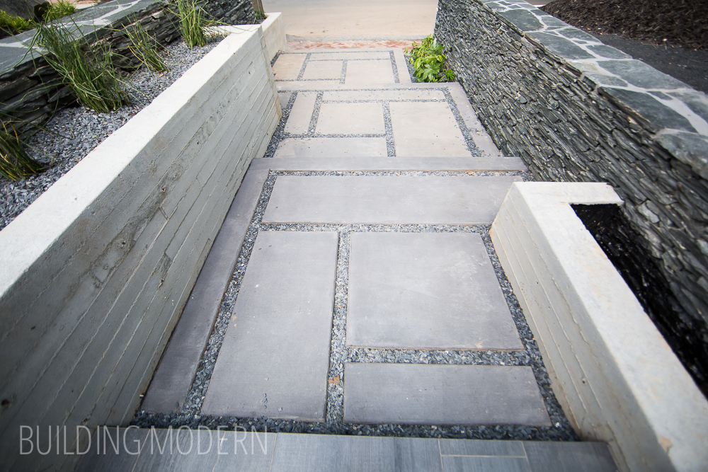
Back outside, looking at the walkway’s stair platforms in concrete and slate chips:
More exterior shots:
Really cool and thoughtful layout with very nice finishings. The basics of the upstairs guest bedroom/living space/master bedroom is very similar to what we had in mind if we could build a house – on a much larger scale though.