The Modern Atlanta Home Tour is a two day self-guided tour of homes in Atlanta. The architecture tour is mostly private residences, but occasionally a few commercial buildings are featured. It is usually held on a weekend in mid June – MA was founded in 2007. The tour is the finale of “Design is Human Week” – a week of speakers and events focusing on design, sustainability, and innovation.
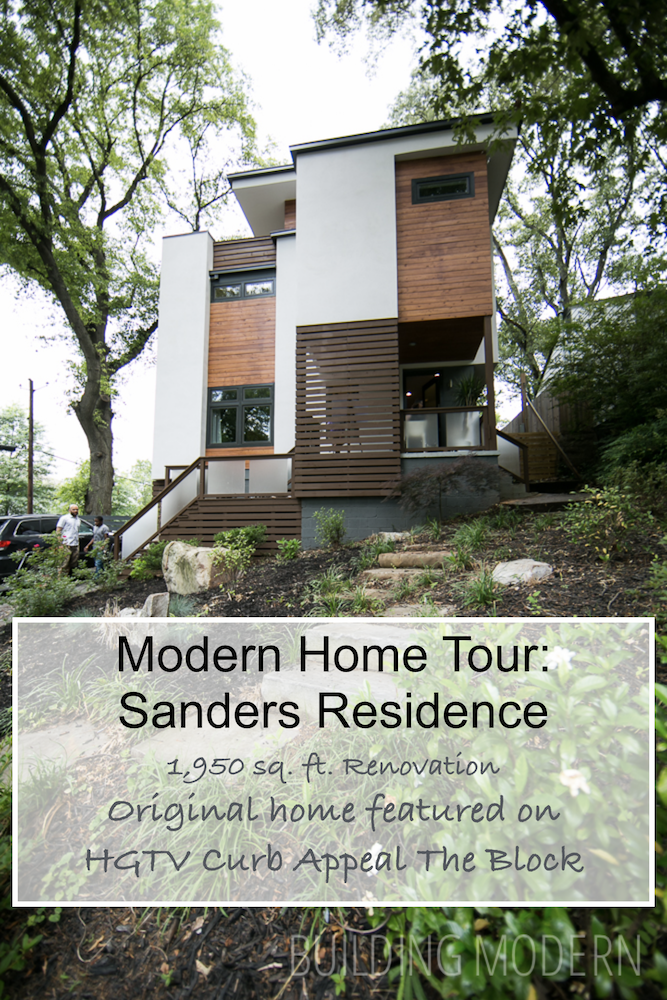
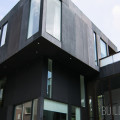
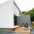
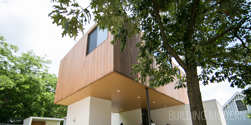
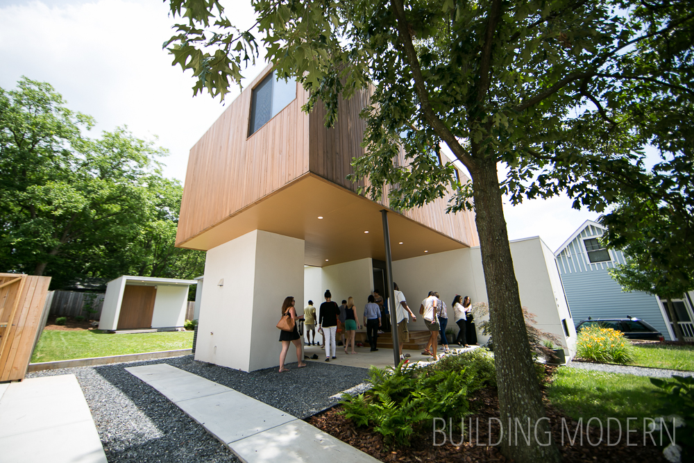
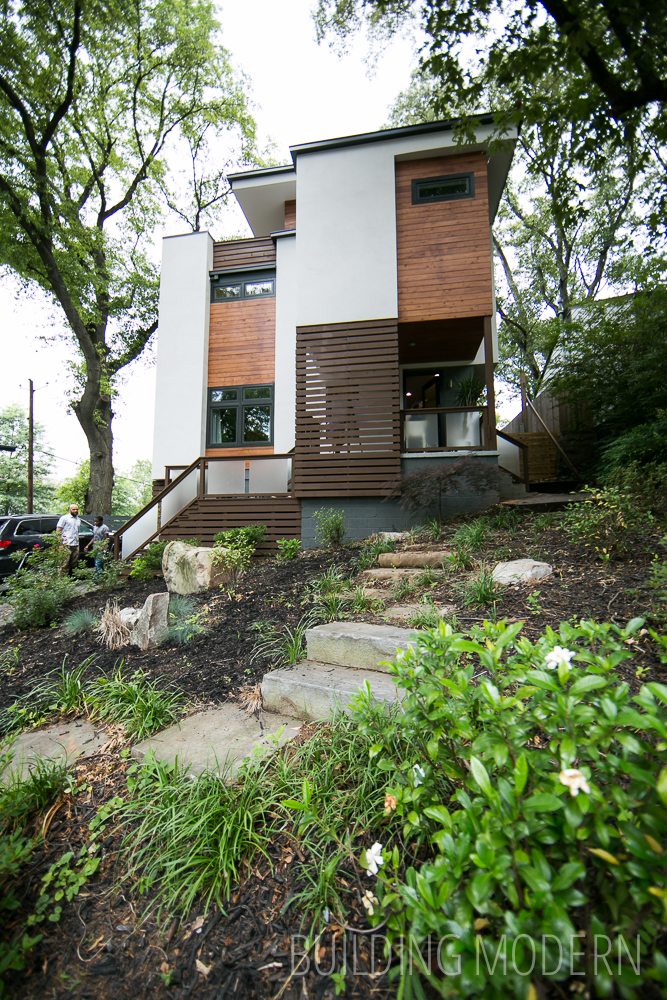
Project Name: Sanders Residence
Location: 1016 Sanders Ave SE, Atlanta, Ga 30316
Architect: Jordache K. Avery of XMETRICAL, LLC
Year Compledted: 2013
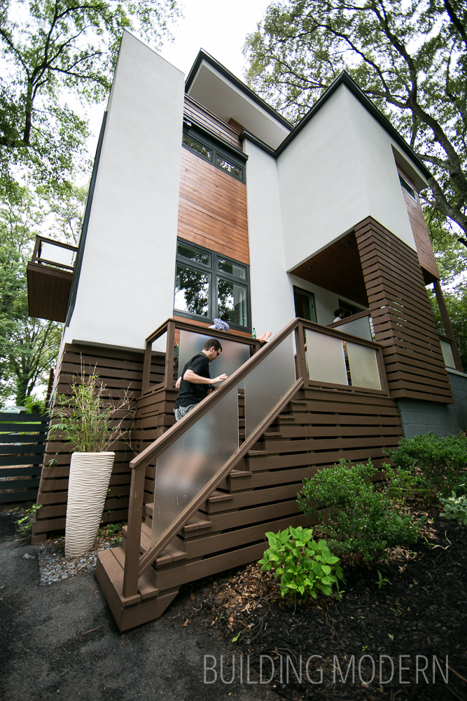
Square Footage: Three Stories: 300 Sq. Ft. of conditioned space, 1200 Sq. Ft. of outdoor living space, 900 Sq. Ft. roof deck
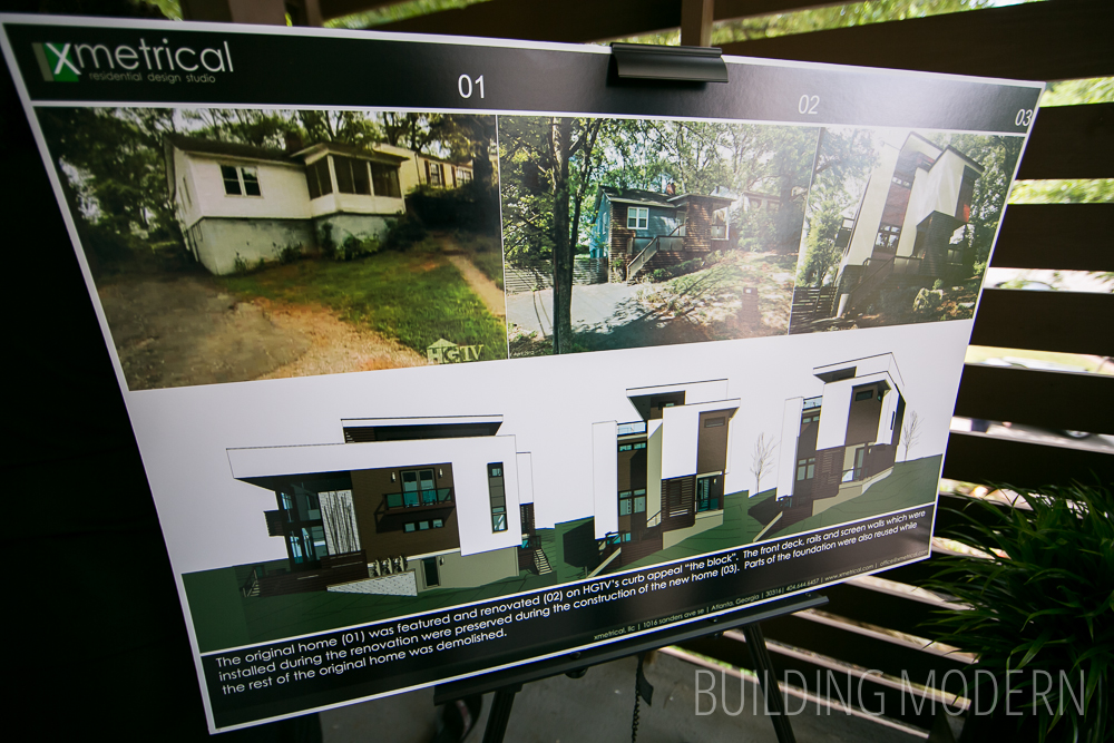
4 bedrooms & 4 baths. New construction built on an existing foundation. The original home was featured in a 2010 episode of HGTV’s Curb Appeal The Block.
1st floor: bedrooms, living room, kitchen, & dining room
2nd floor: bedrooms & an additional living space
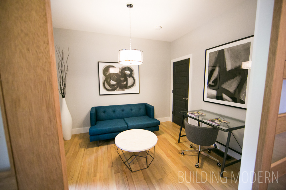
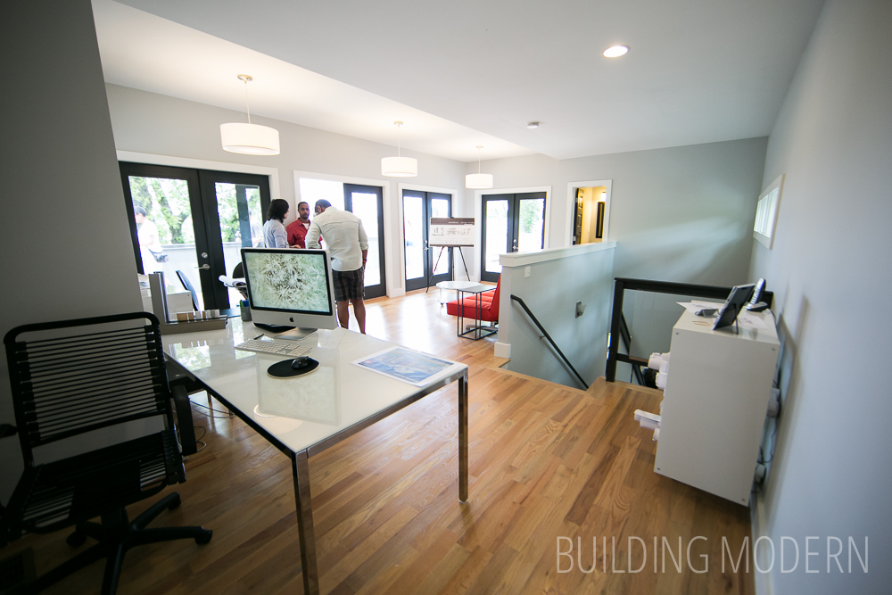
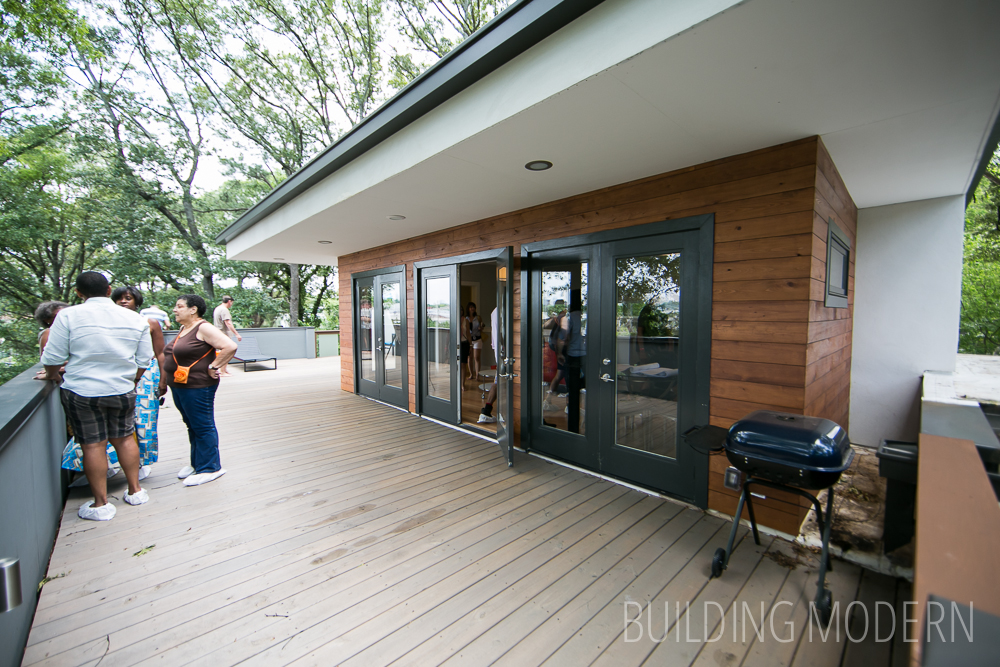
3rd floor: office & roof top deck
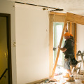
Before, Curb Appeal the Block renovation, & Complete remodel:
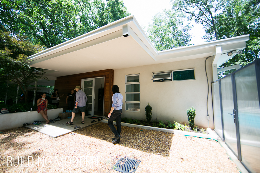
View from the front door.
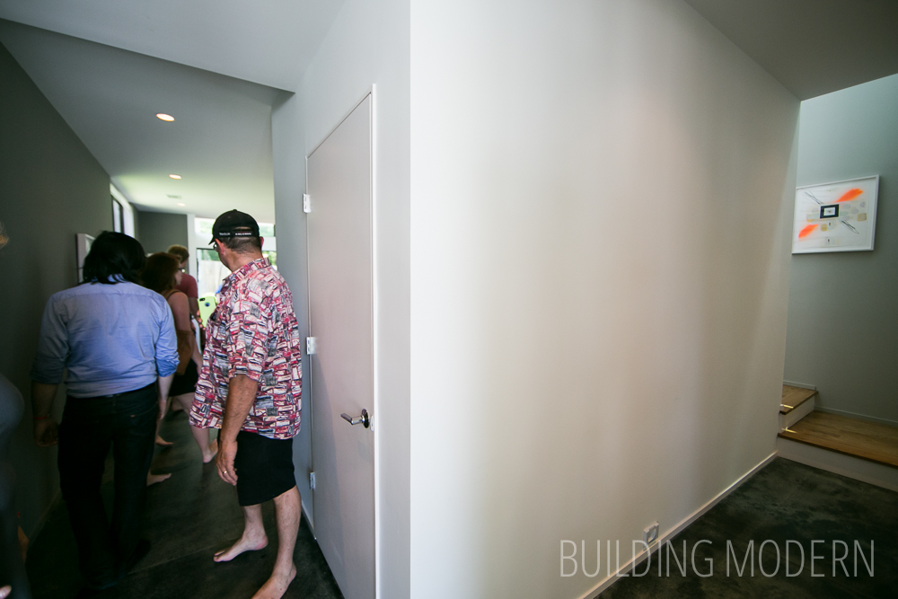
First bedroom on the left. Notice the plain white 1×6? baseboard and charcoal color on the door.
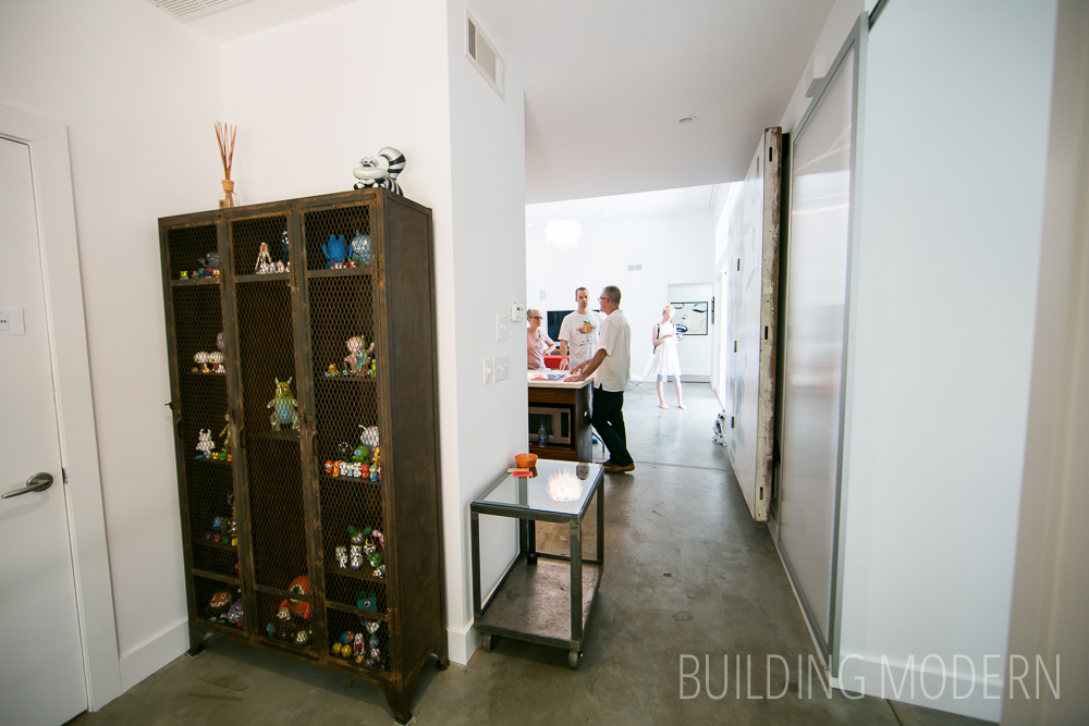
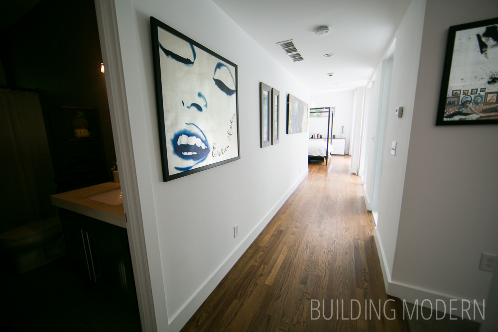
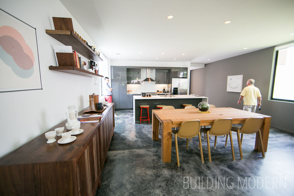
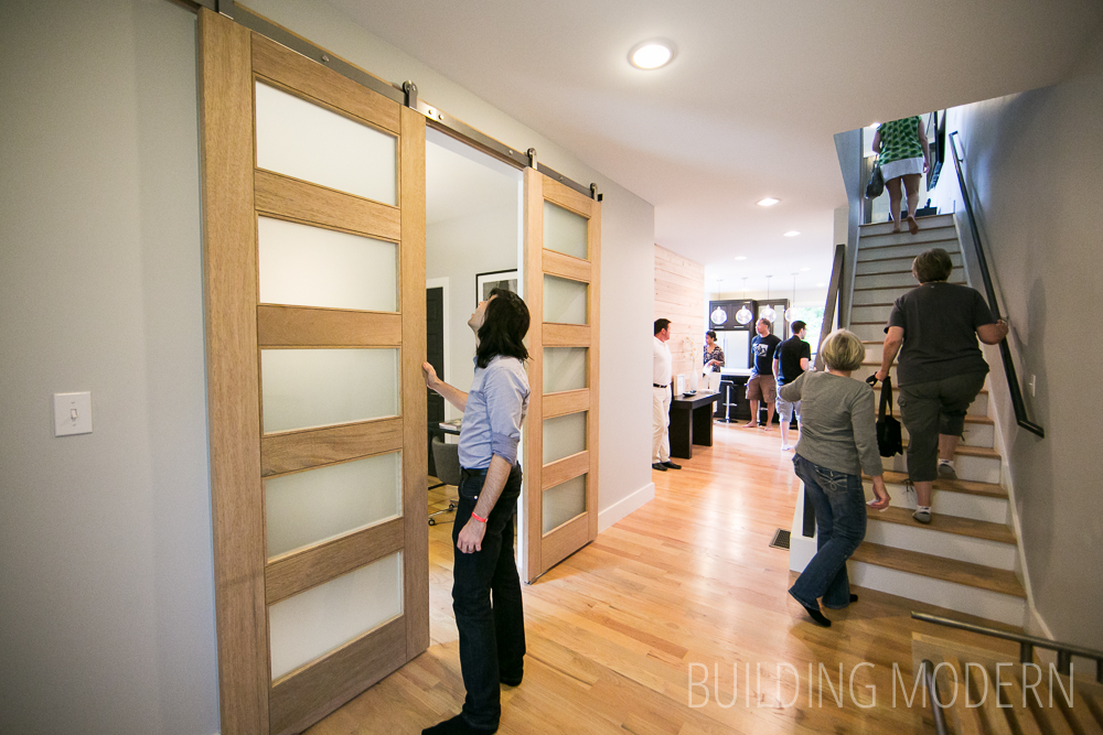
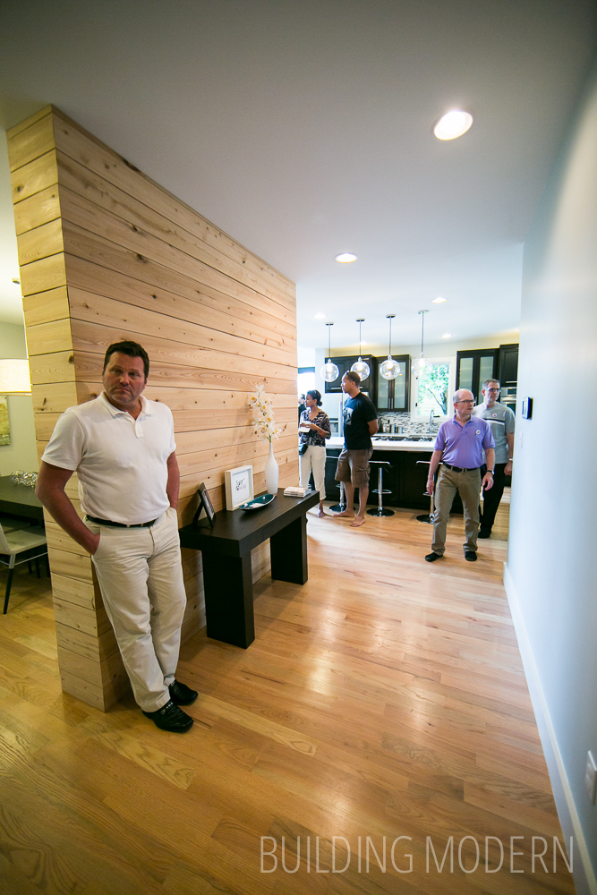
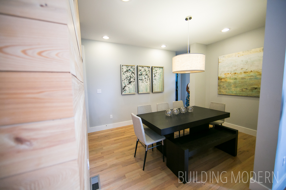
Continuing down the hall – the dining room is behind the “feature” wall, the kitchen is at the back of the house.
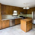
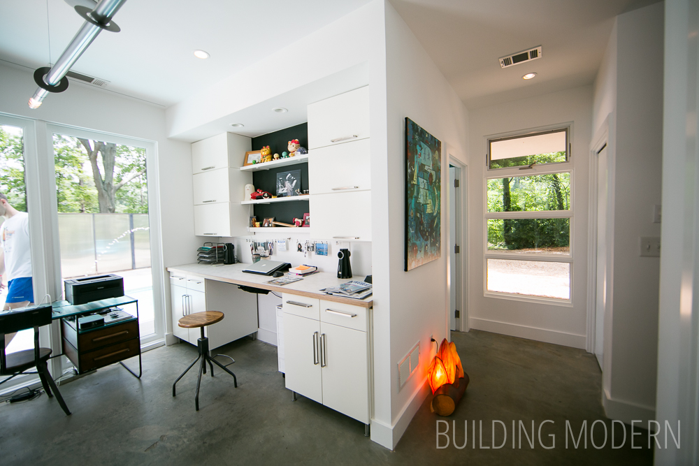
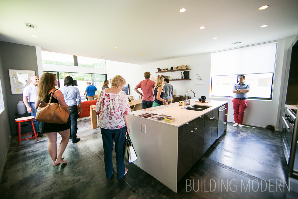
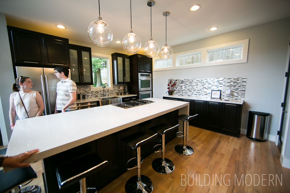
The kitchen. A bit more updated-traditional looking for a “modern” home. Some “modern” elements would be the fixed windows, trim/baseboards, & waterfall countertop. I don’t really care for the backsplash against the side wall… it just looks unfinished or like an afterthought. After seeing a charcoal accent color on the wood work throughout the rest of the house, it makes the kitchen seem even more out of place with its deep chestnut brown cabinets.
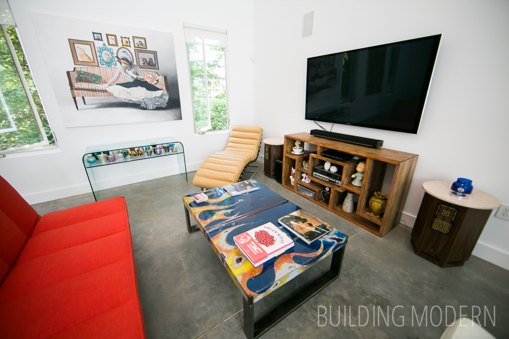
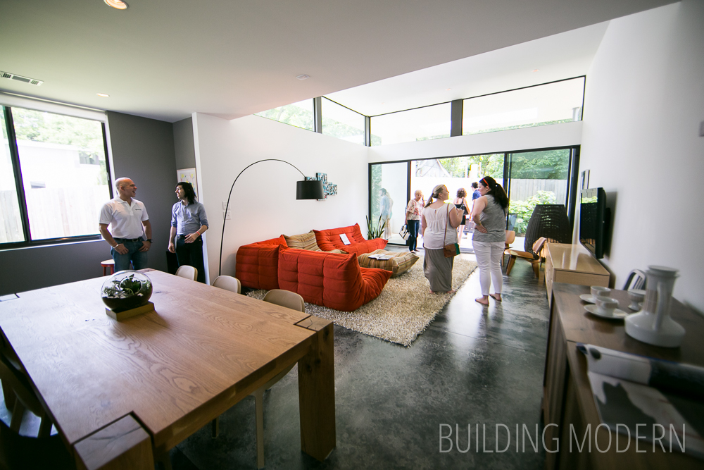
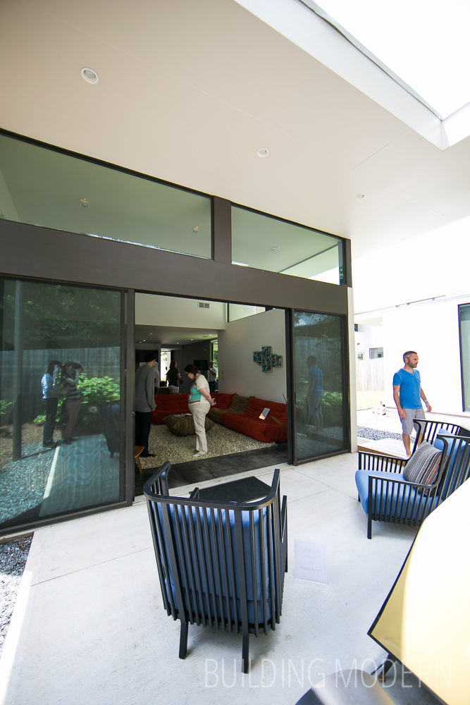
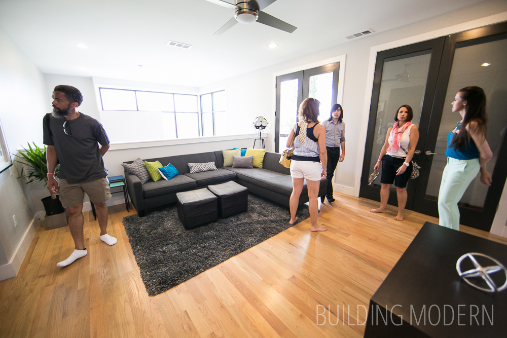
View of the living room from the kitchen. The most modern-looking element of the house (aside from the exterior).
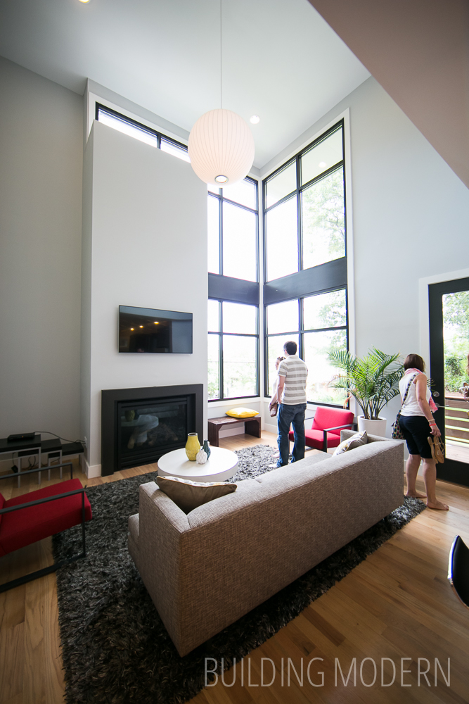
The living room looking back toward the kitchen & hall. The second story “second living room” space can be seen above the kitchen.

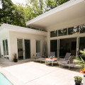
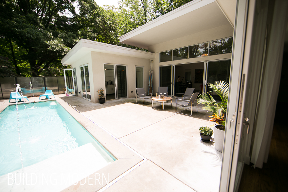
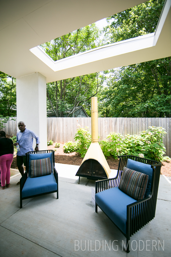
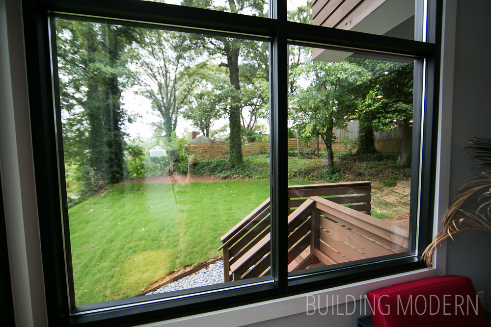
The back yard.
The dining room.
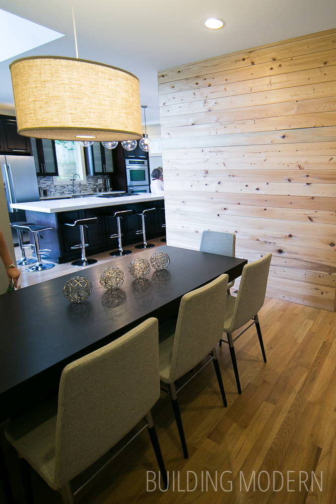
Looking back toward the kitchen.
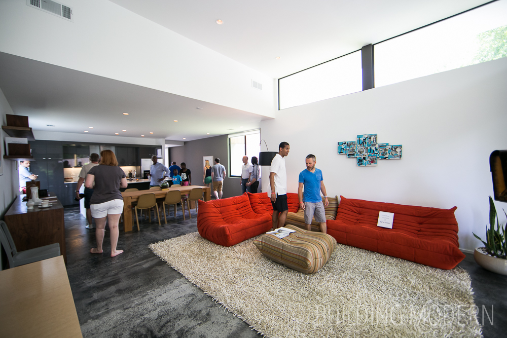
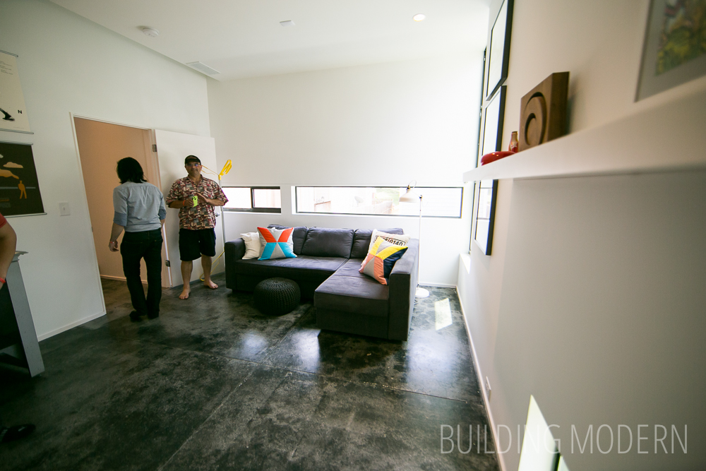
The second floor: Second living room.
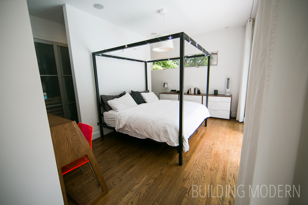
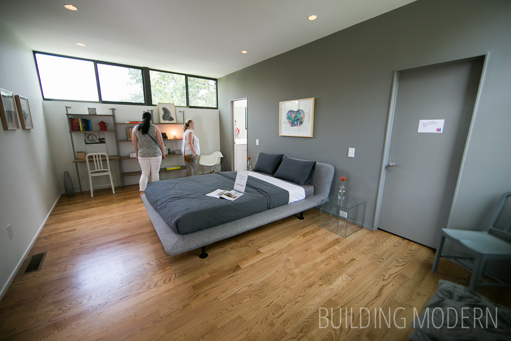
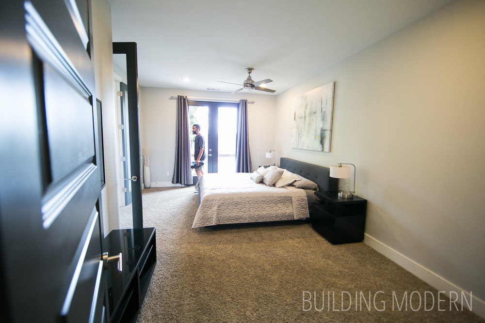
Master bedroom.
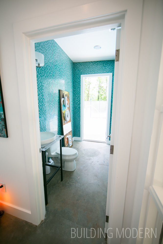
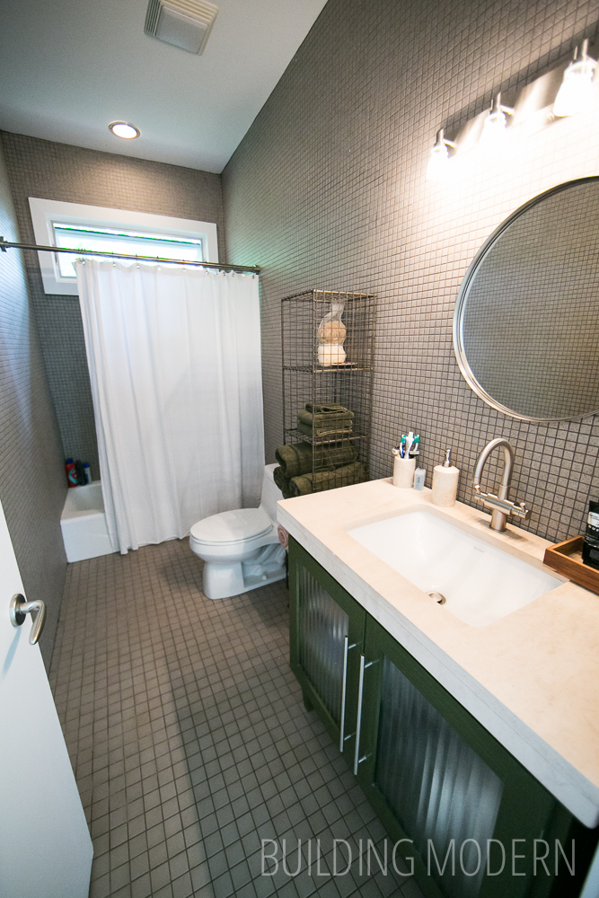
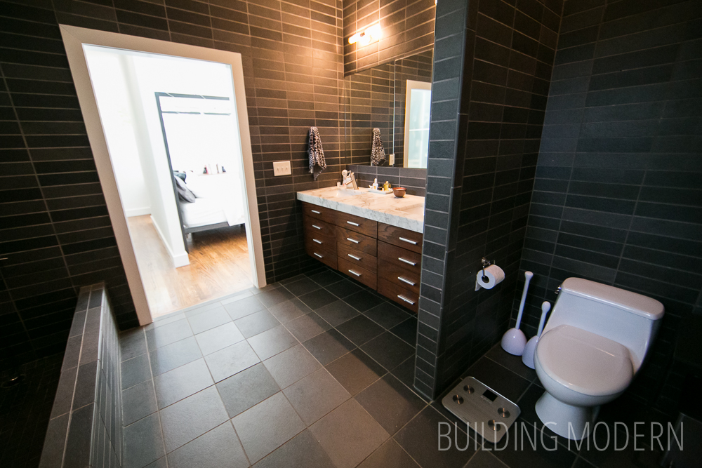
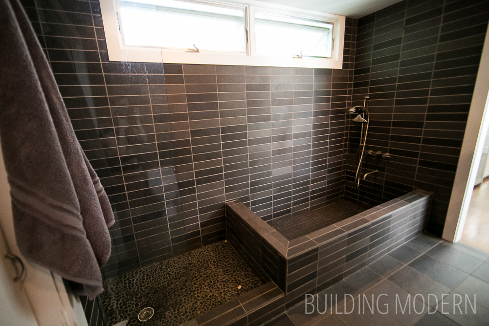
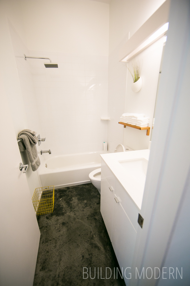
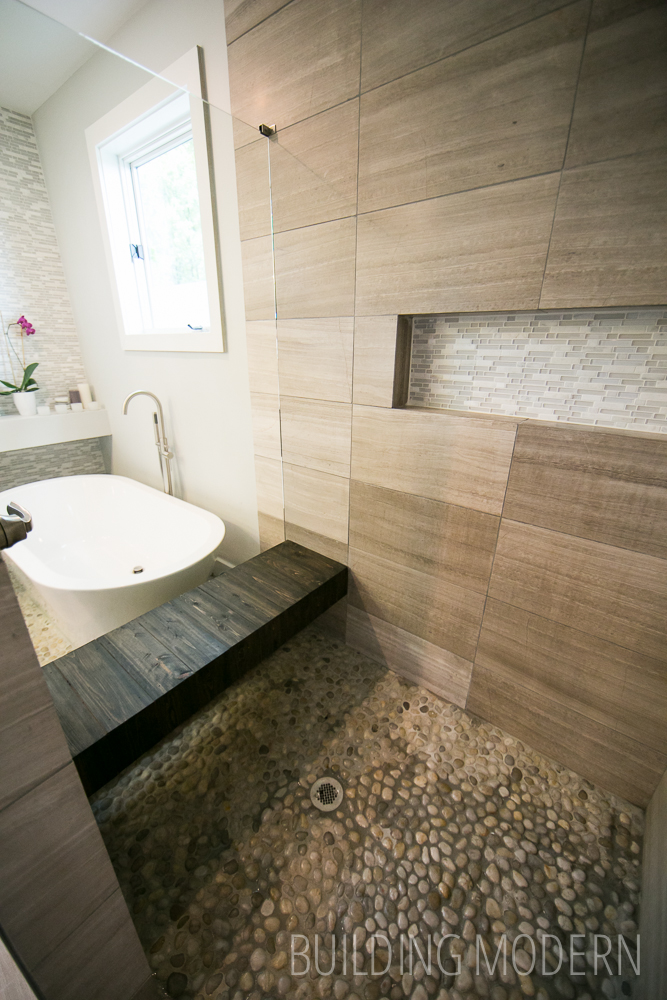
Master bath.
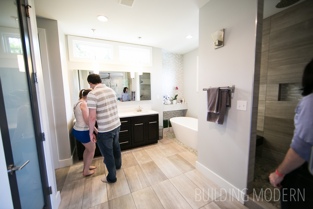
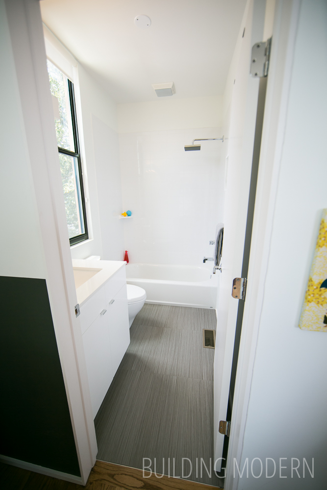
While the tile is not specifically my taste, I do like the shared floor material between the shower and tub. The glass helps keep the illusion of the shared shower/tub space – I would have liked the same tile running along the floor and up the wall, however.

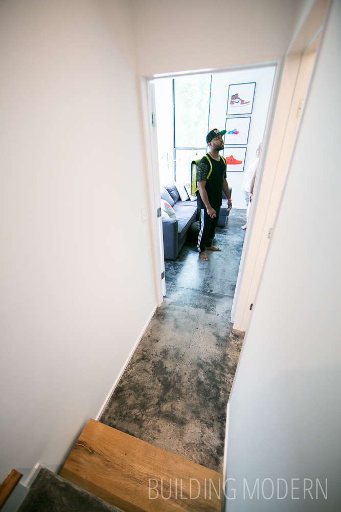
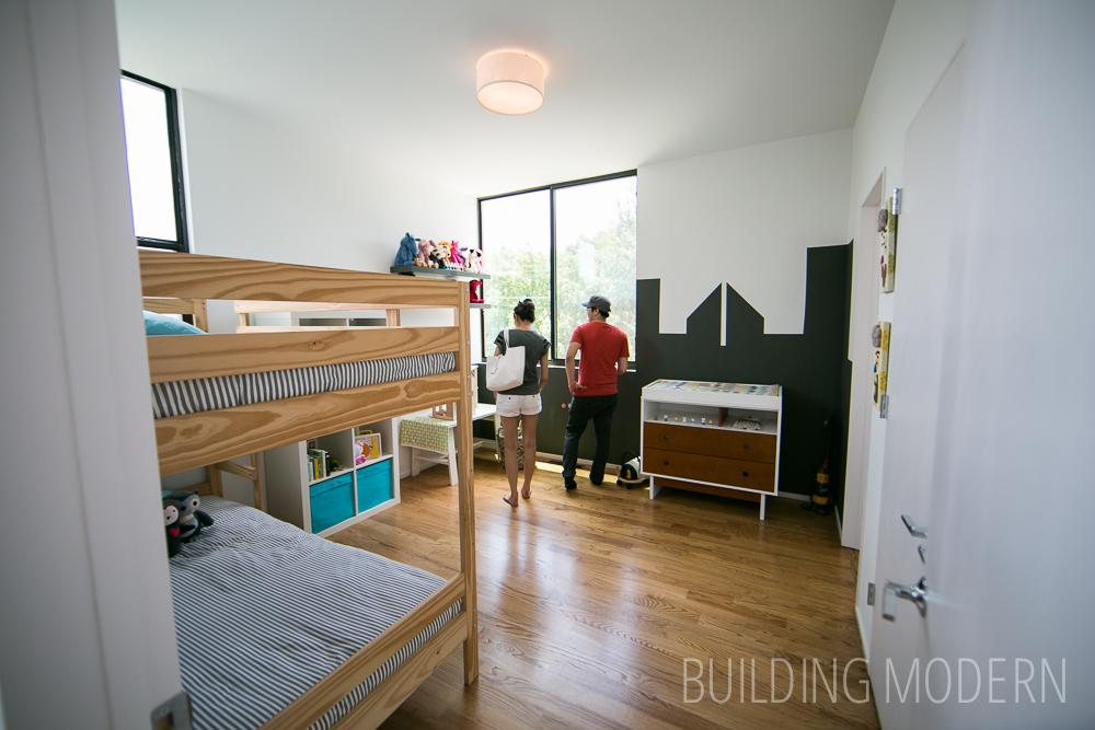
Third bedroom.
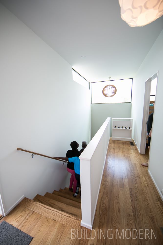
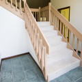
Stair detail: wood structure with frosted plexiglass panels.

The third floor: office.
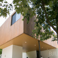
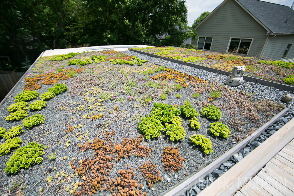
Third floor roof deck.
Overall, this layout was a nicely designed, but the finishings were not great. For a house that was built in 2013, I was surprised at the scuffed walls and broken plexiglass panels. The level of finish work was also not there: inexpensive frieze carpet in the bedrooms, sloppy paint in some areas, and the miters on the “feature wall” were poorly done.
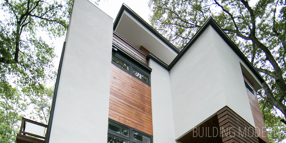
On a positive note, it was neat to see how the architect could take an existing foundation and expand vertically. There were some similar choices that we were making for our own home: what looked like simple 1×6 baseboard, & the occasional charcoal grey trim color. I was accustomed to seeing charcoal with a stained wood combination before, but this house also had painted / possibly an opaque-stained brown wood detail on the exterior… It was nice the see brown & grey paired together in a fairly successful combination.